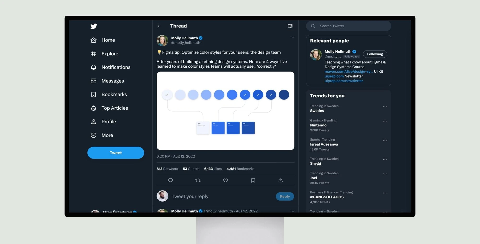
The tweets are from Molly Hellmuth, who is sharing tips for optimizing color styles in design systems built with Figma. The tweets discuss ways to structure and name color styles to make them scalable, accessible and easy for design teams to use correctly. Some of the tips include:
– Creating a small, cohesive color palette that can scale as the product grows
– Giving text colors priority by creating styles for different states like primary/secondary/disabled text
– Including some dark theme support colors for components even in light theme-focused products
– Structuring color names and descriptions in a clear, hierarchical way
– Creating a color key with a range of shades and tints to allow for flexibility
The overall message is about thoughtfully designing color styles in a way that meets accessibility standards and supports designers’ needs as a product evolves over time.