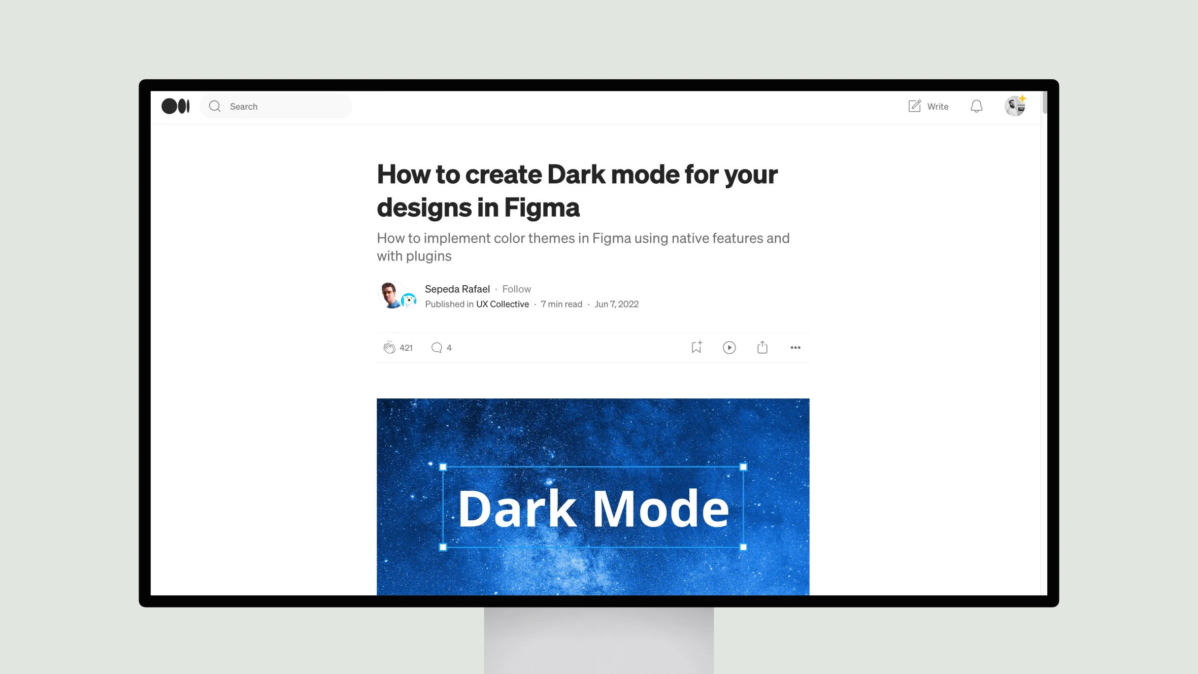
In this insightful piece, Sepeda Rafael outlines several effective strategies for implementing dark themes in Figma. Rafael notes that most platforms now support dark mode, so users expect a consistent experience across light and dark.
Rafael begins by exploring the option of dedicated light and dark components. While simple, this approach becomes unwieldy at scale. A better solution, Rafael asserts, is defining semantic color tokens that map neatly between light and dark variations.
Next, Rafael reviews Figma’s built-in methods for toggling themes, like swapping colors manually or via libraries. While workable, these have limitations. More sophisticated options include plugins like Appearance and Figma Tokens, allowing granular control over selected areas.
Particularly clever are generators like Dark Mode Magic that derive dark palettes automatically. In sum, Rafael’s real-world experience shines through in discussing challenges and solutions seasoned designers face in building for multiple modes. His balanced perspectives will benefit anyone navigating the growing need for flexible thematic designs.

