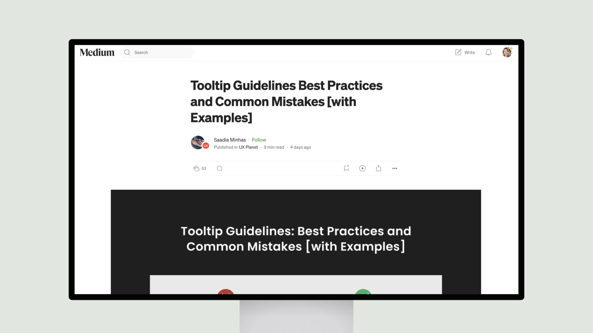
Tooltips are a crucial UI element that can significantly enhance the user experience when designed and implemented correctly.
Saadia Minhas delves into the best practices for designing effective tooltips, emphasizing the need for clarity, conciseness, and consistency. Tooltips should convey a clear and helpful message, avoiding technical jargon and lengthy explanations. Placement and timing are also critical, as tooltips should appear near the relevant UI element without obstructing the user’s workflow.
Saadia Minhas also cautions against common mistakes, such as overusing tooltips, poor timing and placement, inconsistent design, neglecting mobile users, and displaying critical information in tooltips rather than making it permanently visible. These pitfalls can undermine the effectiveness of tooltips and frustrate users.

