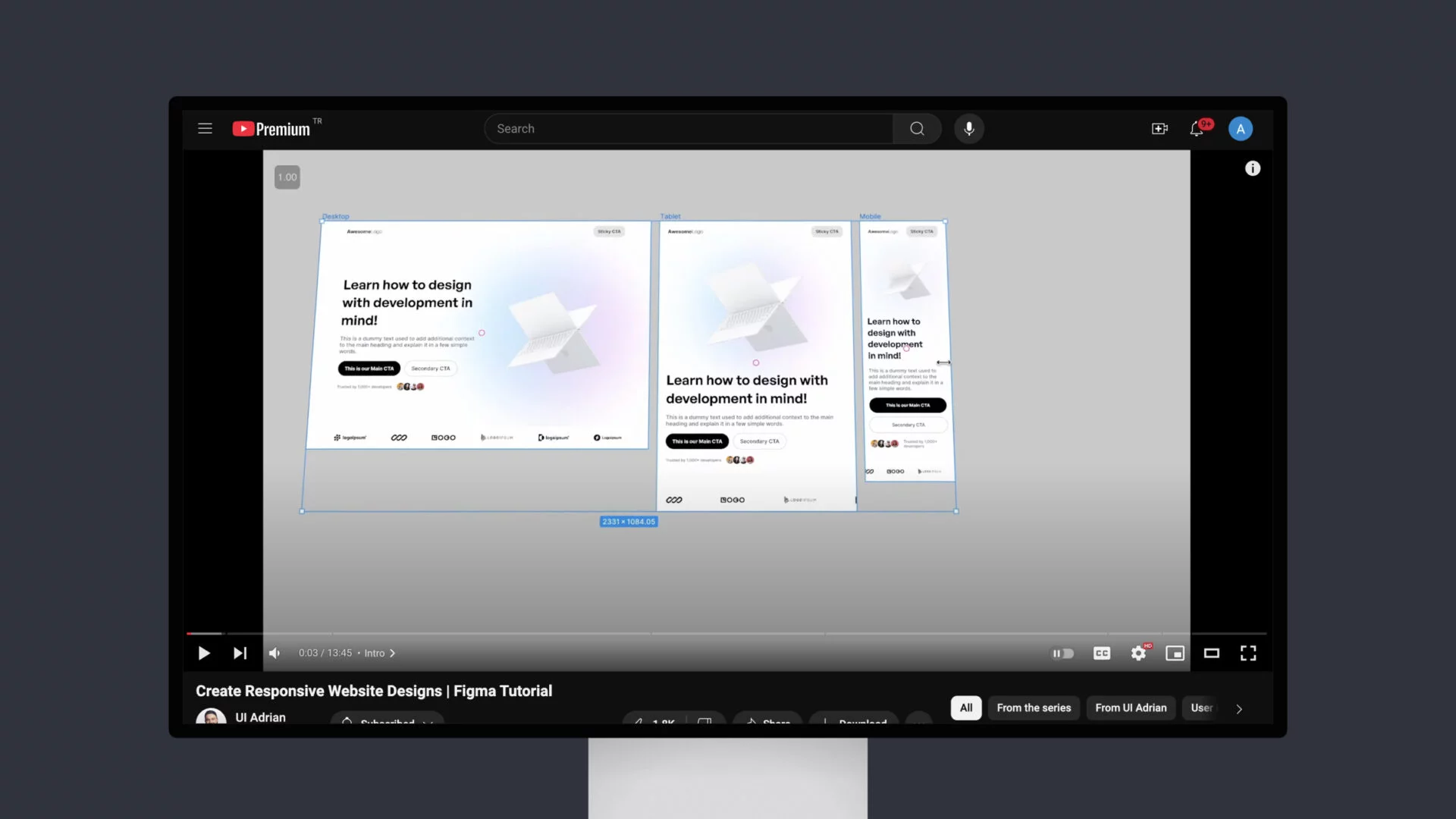
A comprehensive guide to creating responsive website designs using Figma, the popular design tool. The instructor, UI Adrian (Adrian Kuleszo), walks viewers through the entire process, starting from the basics of getting started and moving on to more advanced techniques.
The tutorial covers various topics, including fixing the header, hero, and logos, designing for tablet and mobile devices, and the importance of Auto Layout in Figma. The instructor also discusses the transition from Figma to Framer, a popular prototyping tool.
Throughout the tutorial, Adrian Kulezso emphasizes the importance of creating 100% responsive web designs using Auto Layout without relying on plugins or constraints. This approach ensures that the designs are easily adaptable to different screen sizes and devices, making them more accessible and user-friendly.
The video also includes links to the instructor’s design ebooks and Figma Mastery video course, which provide additional resources for those interested in learning more about UI/UX design and Figma.

![5 ChatGPT Prompt Templates for UX Designers [FREE]](https://fountn.design/wp-content/uploads/2025/01/5-ChatGPT-Prompt-Templates-for-UX-Designers-FREE--600x338.webp)