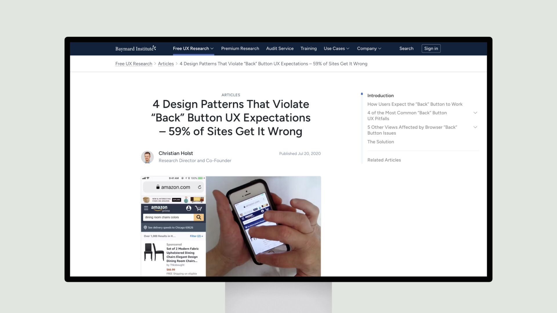
The “Back” button is a fundamental part of web navigation, and users have developed particular expectations about how it should behave. However, many common web design patterns, such as overlays, filtering, and accordion checkouts, often violate these expectations, leading to user frustration and abandonment.
The key takeaway is that understanding and accommodating user mental models around the “Back” button is crucial for delivering a high-quality, frustration-free user experience. By addressing these common pitfalls, sites can avoid disorienting users and keep them on track during their journey.

