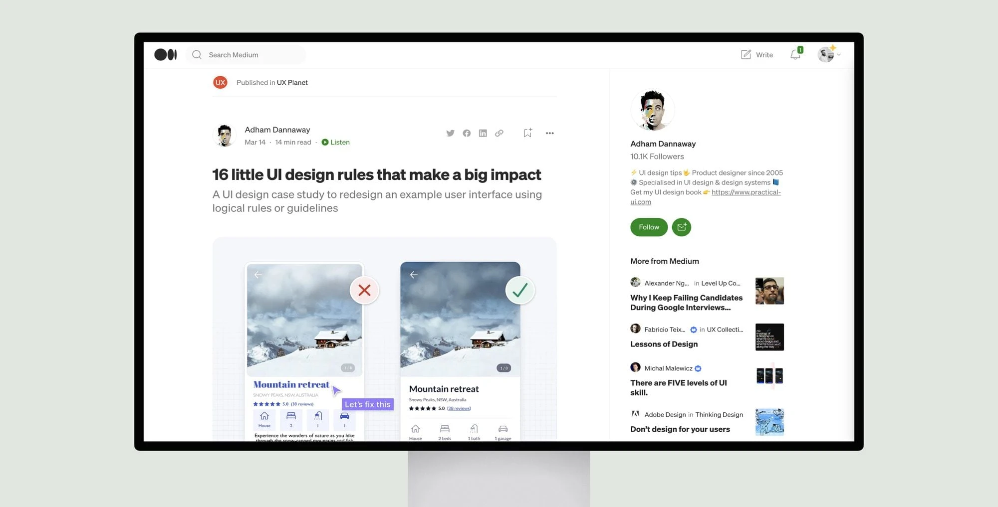
This article provides 16 tips for improving user interface (UI) design through the use of logical rules and guidelines. It uses an example design for a property rental app to demonstrate how each tip can be applied.
The tips cover topics like using space to group related elements, consistency in designs, ensuring similar elements function similarly, creating a clear visual hierarchy, removing unnecessary styles, using color purposefully, meeting accessibility standards for color contrast and text legibility, not relying solely on color, choosing typefaces, and more.
For each tip, the article provides before and after comparisons to show how the example design improves by implementing the suggested changes. It aims to show readers how a system of logical rules can help make informed design decisions and simplify complex interfaces. The concise explanations and visual examples help illustrate how following basic design principles can significantly enhance a user experience.


