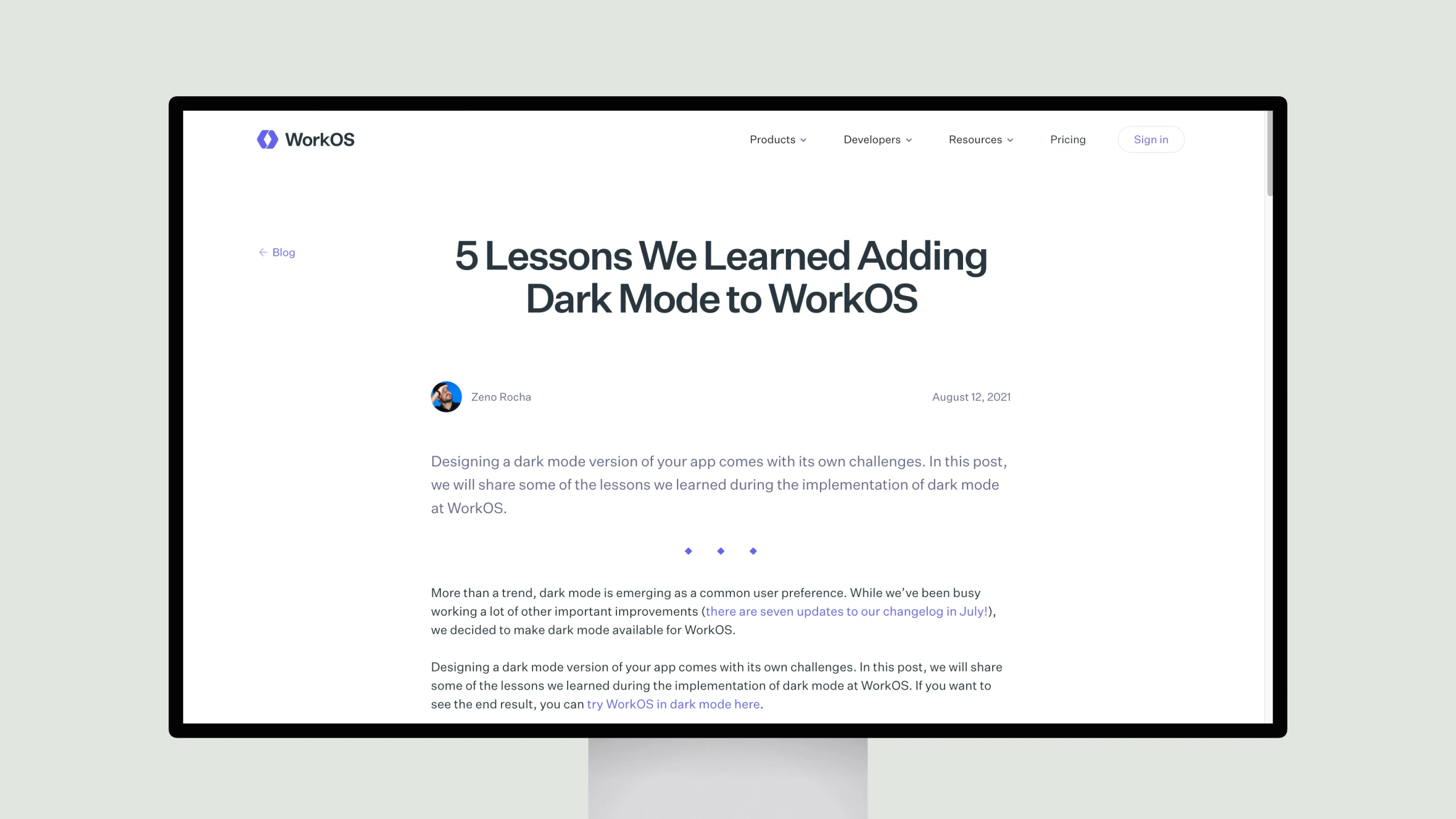
This article by Zeno Rocha, a product designer at WorkOS, outlines five key lessons learned during the implementation of a dark mode feature in their developer tools platform. Rocha details the importance of meeting accessibility standards for color contrast when transitioning to a dark theme. Proper use of shades of gray rather than pure black is emphasized, as is desaturating vibrant colors that could cause eye strain against a dark background.
The article also notes that visual hierarchy must be established through alternative methods like borders rather than shadows in a dark mode. A final lesson is allowing users flexibility to choose between light, dark or system default themes to best suit their individual needs or use cases. Overall this is a thoughtful examination of practical considerations shared by WorkOS to help other developers successfully design and roll out a dark mode option for their own applications and services.


