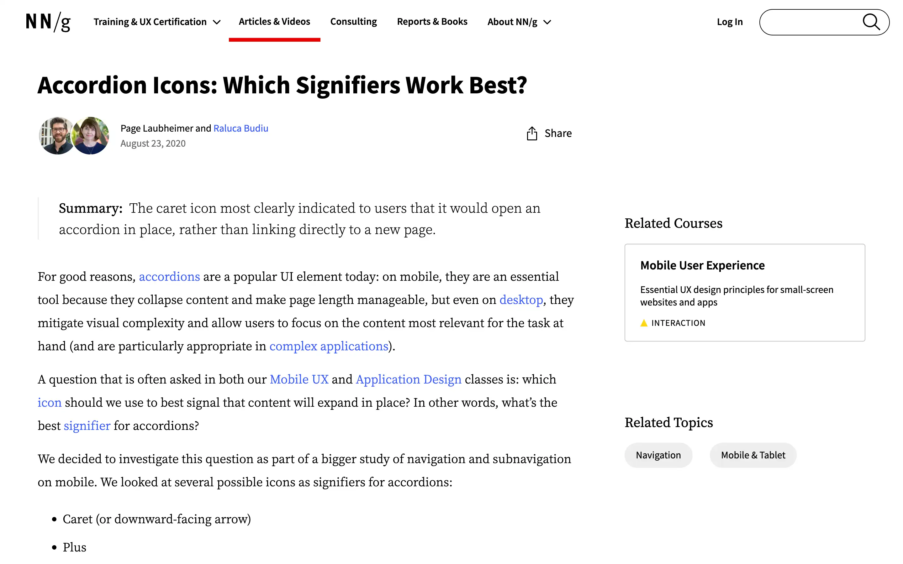
Accordions are a popular UI element, especially on mobile, as they allow users to collapse and expand content to manage page length and focus on the most relevant information. However, the choice of icon used to signal an accordion can significantly impact user expectations and behavior.
The study investigated several common accordion icons—a caret, plus, right-facing arrow, and a nonsense “foil” icon—to determine which most effectively conveys that the accordion will expand the content on the same page rather than linking to a new page.
