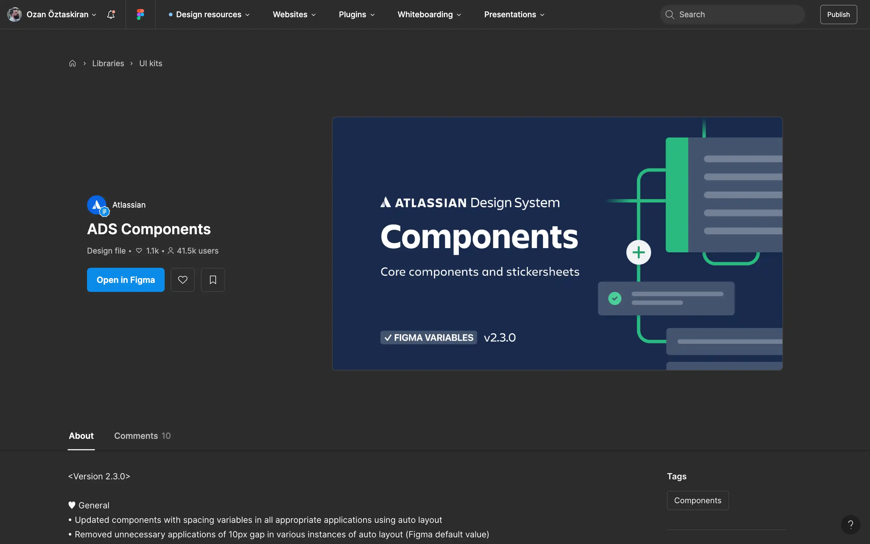
The ADS Components file on Figma Community is Atlassian’s official component library for its design system, built to offer core UI components and stickersheets aligned with Atlassian’s design standards. The resource is intended for product designers and developers building on Atlassian products or inspired by its design philosophy. This system provides meticulously structured, token-driven components that integrate with Figma Variables (as of version 2.0.0 and above), supporting dark mode switching and scalable system-wide updates. The components are built with auto layout, spacing variables, and variants to match development implementation, making it a highly practical tool for designers looking to ensure consistency across interfaces.
Recent updates (as of version 2.3.0) include major improvements to spacing logic across components such as modals, radio buttons, tooltips, drawers, and onboarding flows — refining alignment with code specs and making component properties easier to manage. Additionally, nested properties have been surfaced to improve editing flexibility, and dark mode handling has been transitioned to variable-driven logic. The file also includes detailed patch notes for over ten previous versions, documenting granular updates to individual elements like sliders, forms, buttons, and tooltips. With 40K+ users, this file acts as a living component library and reference point for professionals implementing Atlassian’s design language.
