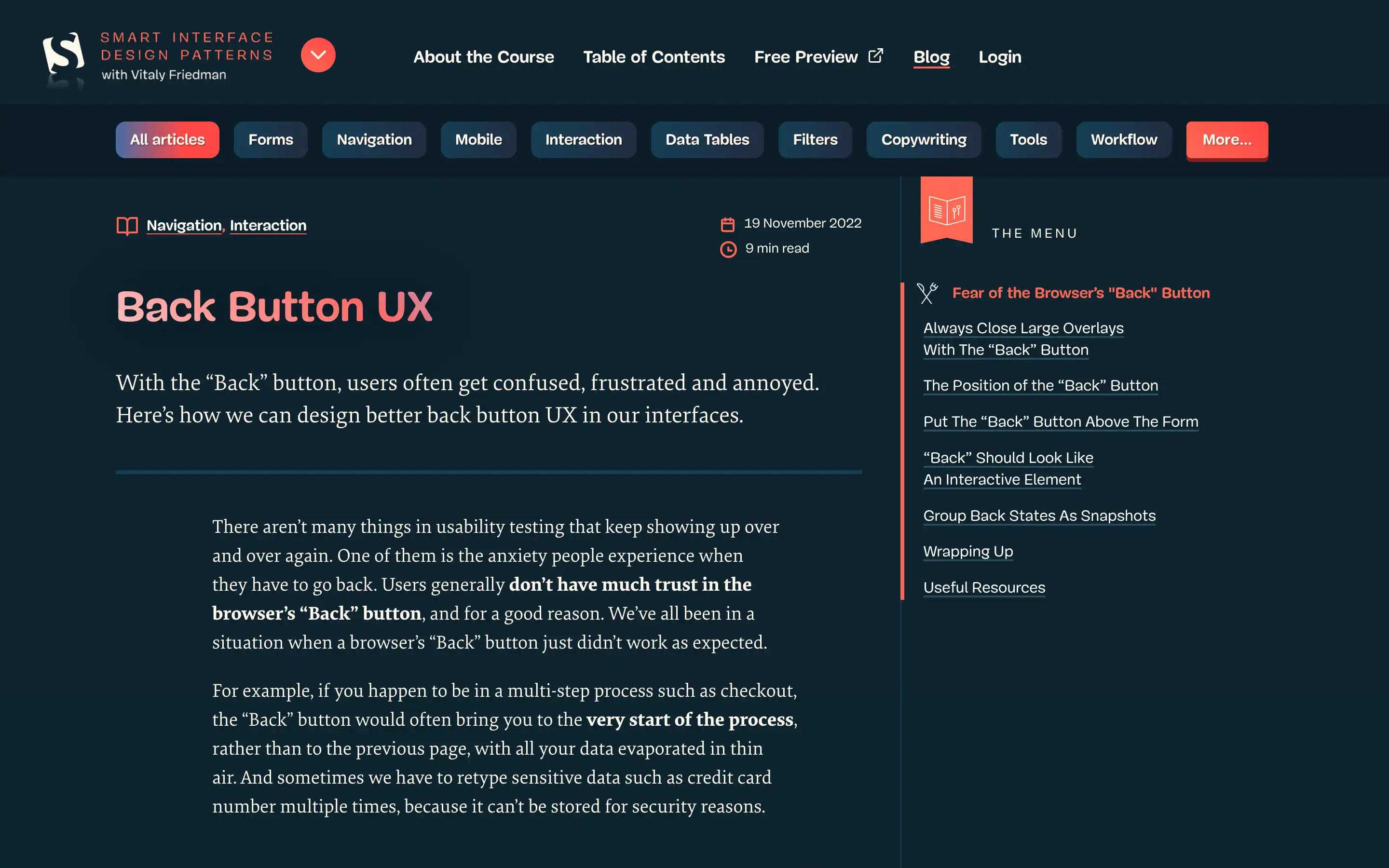
Navigating websites can be a frustrating experience for users, especially when it comes to the dreaded “Back” button. The article delves into the common issues users face with the browser’s “Back” button and provides practical solutions to improve the overall back button UX.
The article emphasizes the importance of aligning user expectations with the behavior of the “Back” button. To further enhance the back button UX, the article recommends making the “Back” button visually distinct and interactive, ensuring users can easily identify and use it.
