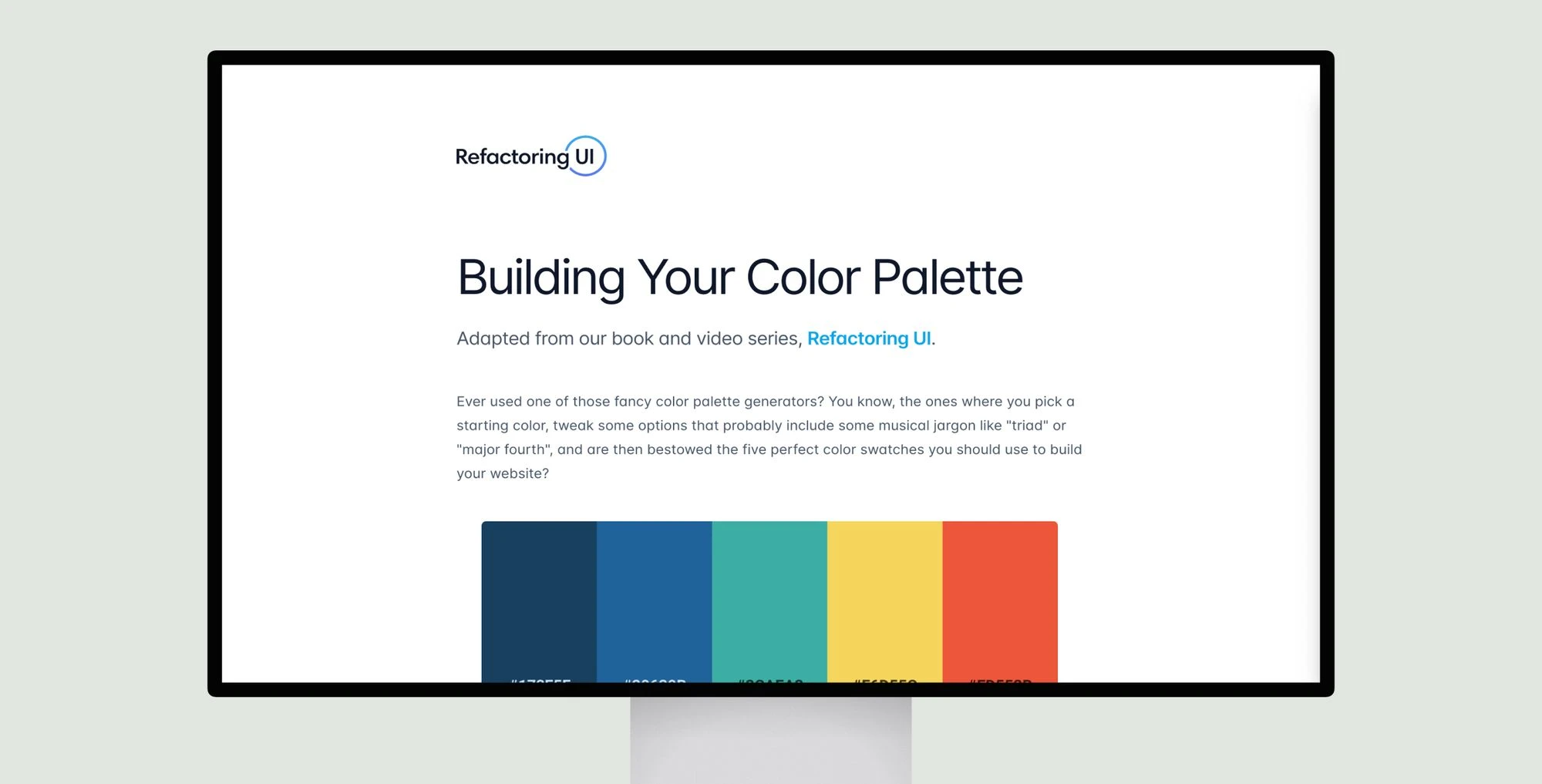
Color palettes should include 8-10 shades of grey for backgrounds, text, and controls. Primary and accent colors need 5-10 shades from light to dark for buttons, alerts, warnings, and more. Define shades upfront rather than generating them dynamically. Choose a base shade for each color, then pick the darkest for text and lightest for backgrounds. Fill in shades between by eye, aiming for around 9 total. Apply process to greys too while prioritizing usability over precision. Tweak as needed but limit new shades.
Building Your Color Palette
Learn to create balanced color palettes with 8-10 greys and 5-10 primary shades for accessible, user-friendly UI design.
Topic(s):
Added on:


