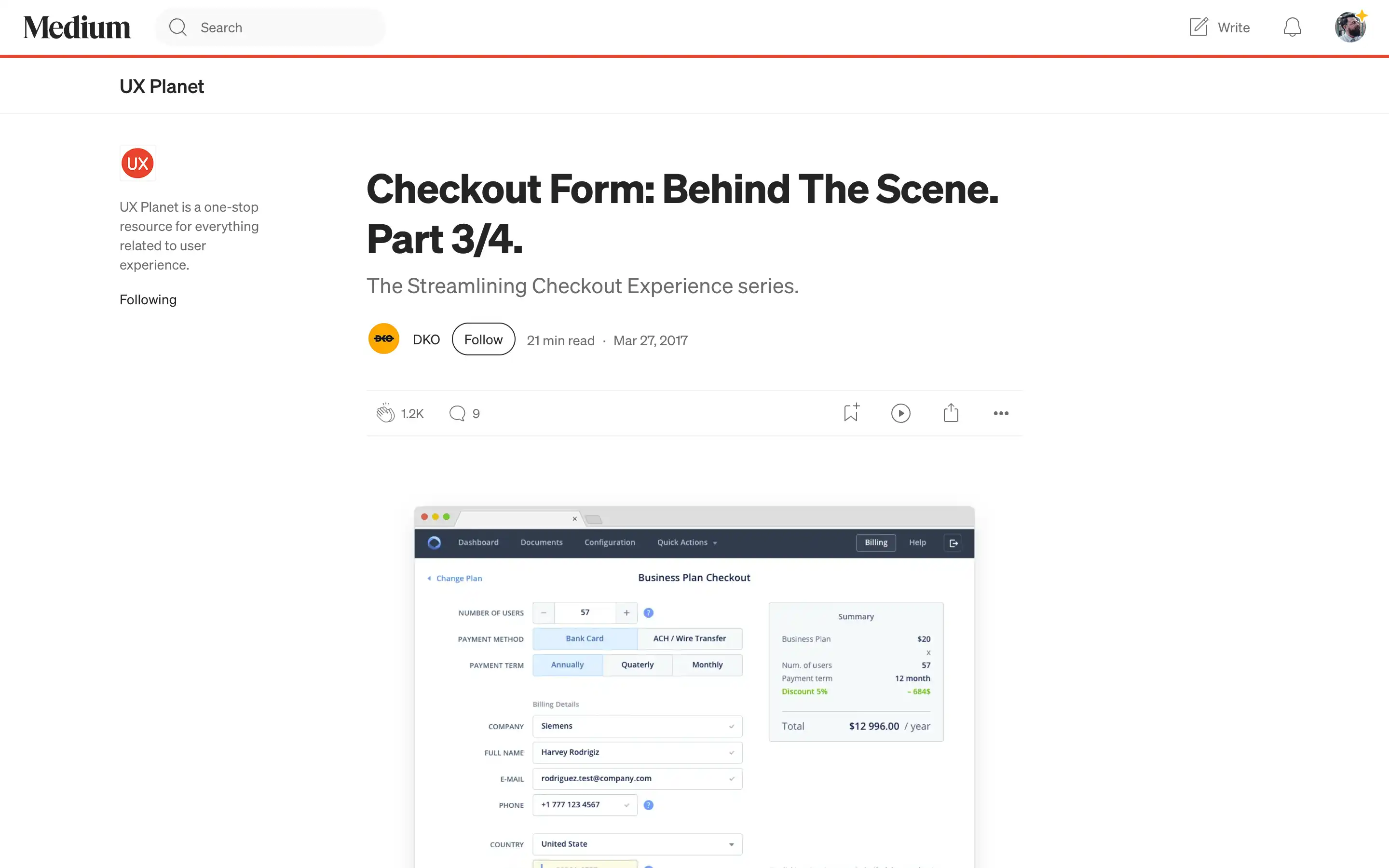
Designing an effective checkout process is crucial for any online business, as it can make or break the customer experience. This comprehensive article delves into the intricacies of streamlining the checkout experience, drawing insights from the DKO’s work on the Fluix B2B product.
The article begins by addressing the key questions that arose during the redesign of Fluix’s checkout process, such as how to simplify the process, minimize errors, and ensure a satisfactory customer experience. The author then dives into the details of the redesigned checkout form, divided into five main sections: Payment Setup, Billing Contact Details, Full Address, Summary, and Bank Card Details.
