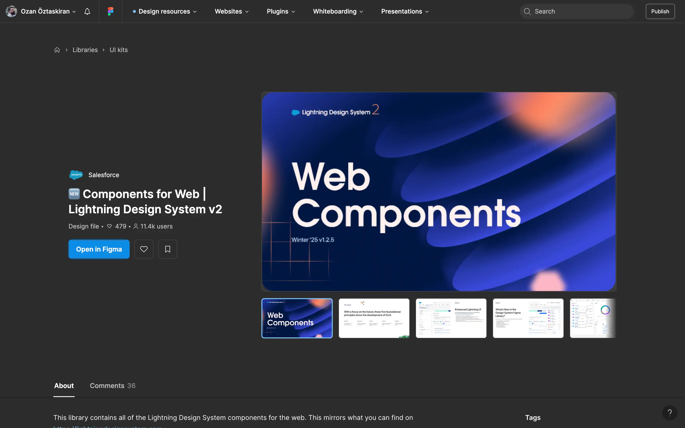
A Figma library released by Salesforce that offers a complete set of pre-built design components for web-based user interfaces, aligned with the Lightning Design System (LDS). This file serves as a mirror of the official Lightning Web Components available through Salesforce’s design system documentation and tools, intended for use by product teams building on Salesforce’s ecosystem. The version included is Winter ’25 v1.2.5, reflecting the most recent updates and enhancements.
The resource is structured to support designers and developers working on web apps by providing a consistent, ready-to-use visual framework. It includes key UI components such as input fields, modals, navigation elements, buttons, and more—styled and configured according to Salesforce’s design principles. This file ensures teams can maintain brand alignment and functional consistency across experiences, with support for accessibility and responsive layouts. All components are production-aligned and integrated with best practices in enterprise-level UI development.
