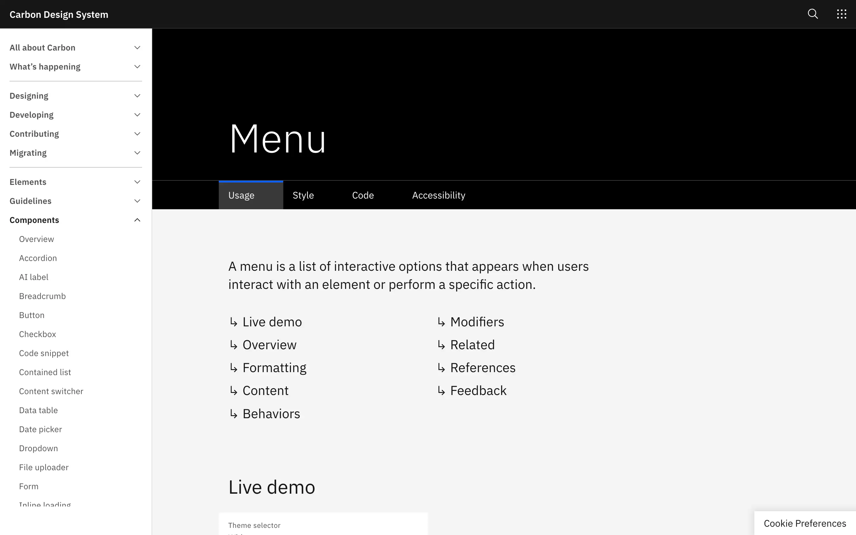
Menus are a crucial component in user interfaces, providing a way for users to access a variety of actions and options. They are handy for decluttering interfaces, offering context-specific actions, and catering to the needs of advanced users. However, menus should be used judiciously, as they are not suitable for form submissions or complex inputs.
Menu formatting is essential, with clear guidelines on anatomy, sizing, alignment, and the use of submenus. Menus should be visually consistent, with items of the same height and width and a minimum width to prevent a narrow appearance. Alignment should be consistent, with menus positioned relative to their triggers, and options should be logically ordered and grouped.
Overall, the guidance provided in this resource covers the essential aspects of menu design, from formatting and behavior to accessibility and integration with other UI elements. By following these best practices, designers and developers can create visually appealing and highly functional menus.


