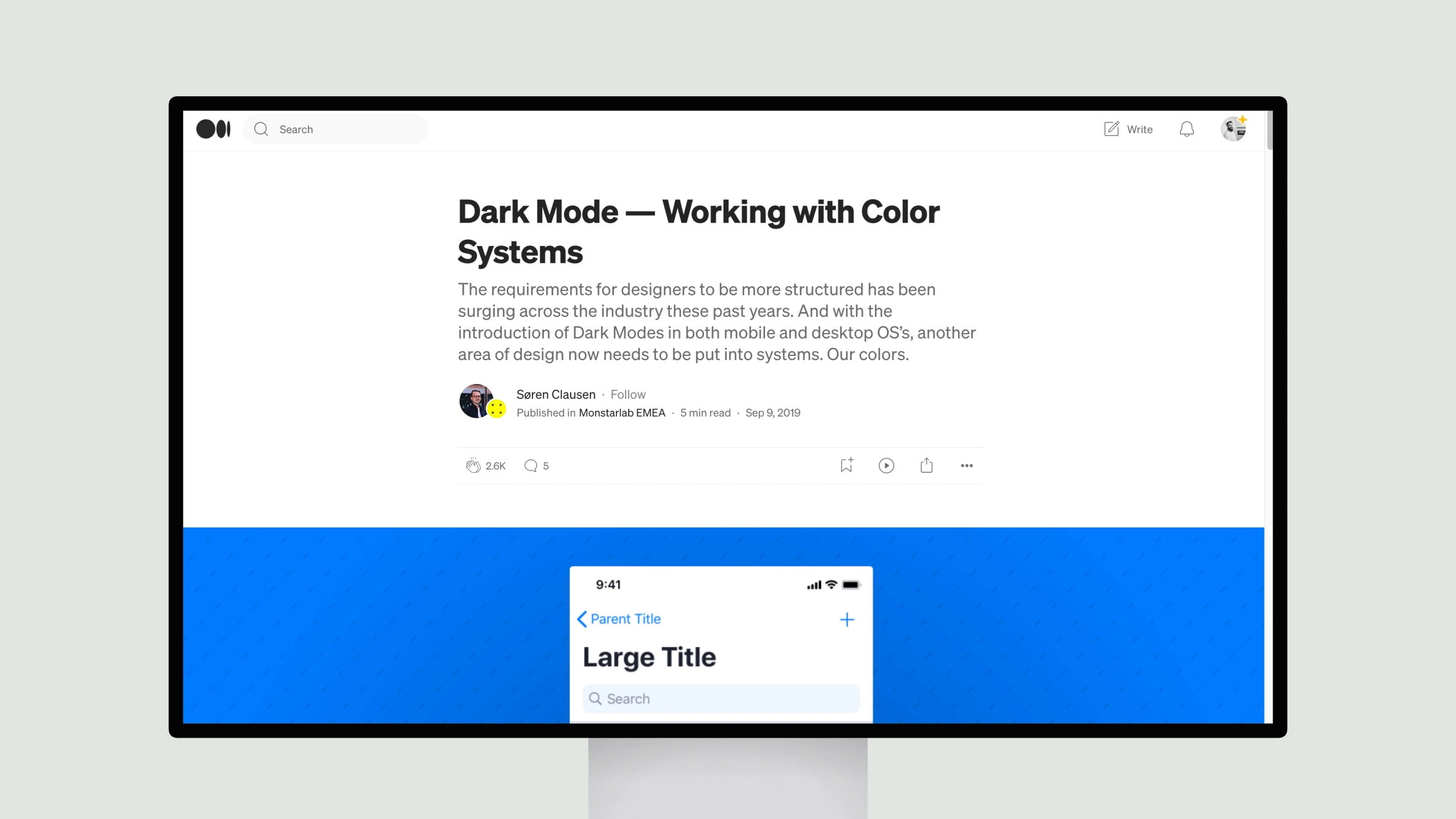
Søren Clausen discusses the importance of establishing systematic color palettes when designing interfaces with multiple modes like light and dark themes. The author outlines a framework for assigning roles and purposes to different colors to ensure consistency. He also demonstrates how to easily switch between light and dark variants by applying new colors mapped to the predefined roles.
Other contributions provide useful insights and best practices and cover topics ranging from mobile app fonts and augmented reality apps to design psychology, illustration systems, and hypothesis-driven product development. Notable names in the design community have authored the selections, sharing their expertise to help others refine their craft.
In summary, this page curates a selection of thoughtful pieces from experienced designers, offering practical guidance and inspiration for those seeking to elevate their work and stay informed on industry trends.


