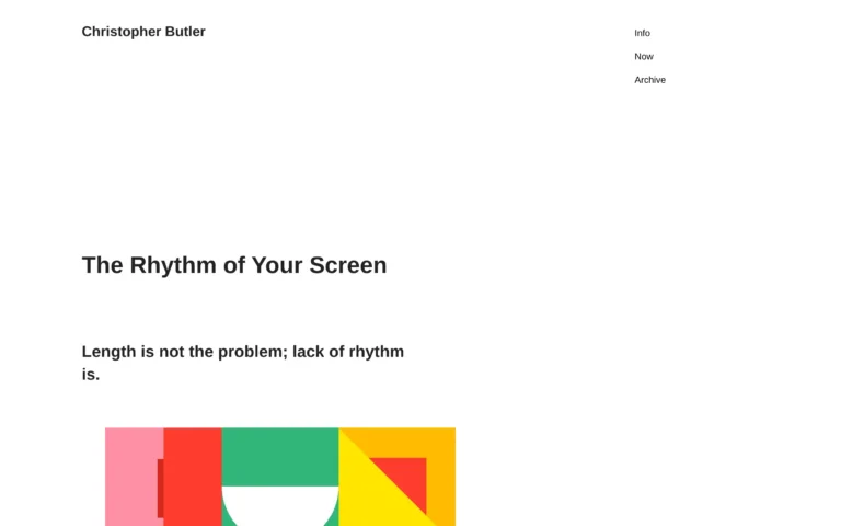
Dan Hollick explores the challenges of creating dark modes that accurately reflect human perception of color and contrast. Hollick delves into how we perceive contrast differently between lighter and darker colors, complicating the task of inverting a design’s color scale for dark mode. He explains that simply flipping the colors is not enough, as contrast between darker greys will be lower. To maintain consistent perception of contrast across light and dark modes, the colors need to be spaced further apart on the grayscale.
Hollick also discusses why dark backgrounds often have a blue tint. While adding colors like green or red significantly alters the tone, blue blending is more subtle and natural. However, transitioning a grayscale smoothly from light to dark while incorporating a blue hue adds another layer of complexity. Throughout, the author shares examples to illustrate these concepts visually.
Helpfully, Hollick includes links to additional threads diving deeper into topics like the APCA contrast model and perceptually uniform color spaces. Designers seeking to optimize designs for all lighting conditions and ensure consistent user experiences will find his insights and examples informative.


