Enterprises often struggle to present vast amounts of information in a user-friendly manner, particularly when transitioning from desktop to mobile platforms. Joe Winter delves into the intricacies of designing a complex data table for mobile consumption, drawing insights from a real-world project in the property insurance industry.
The key focus is understanding how users interact with and consume the information presented in these tables. Winter
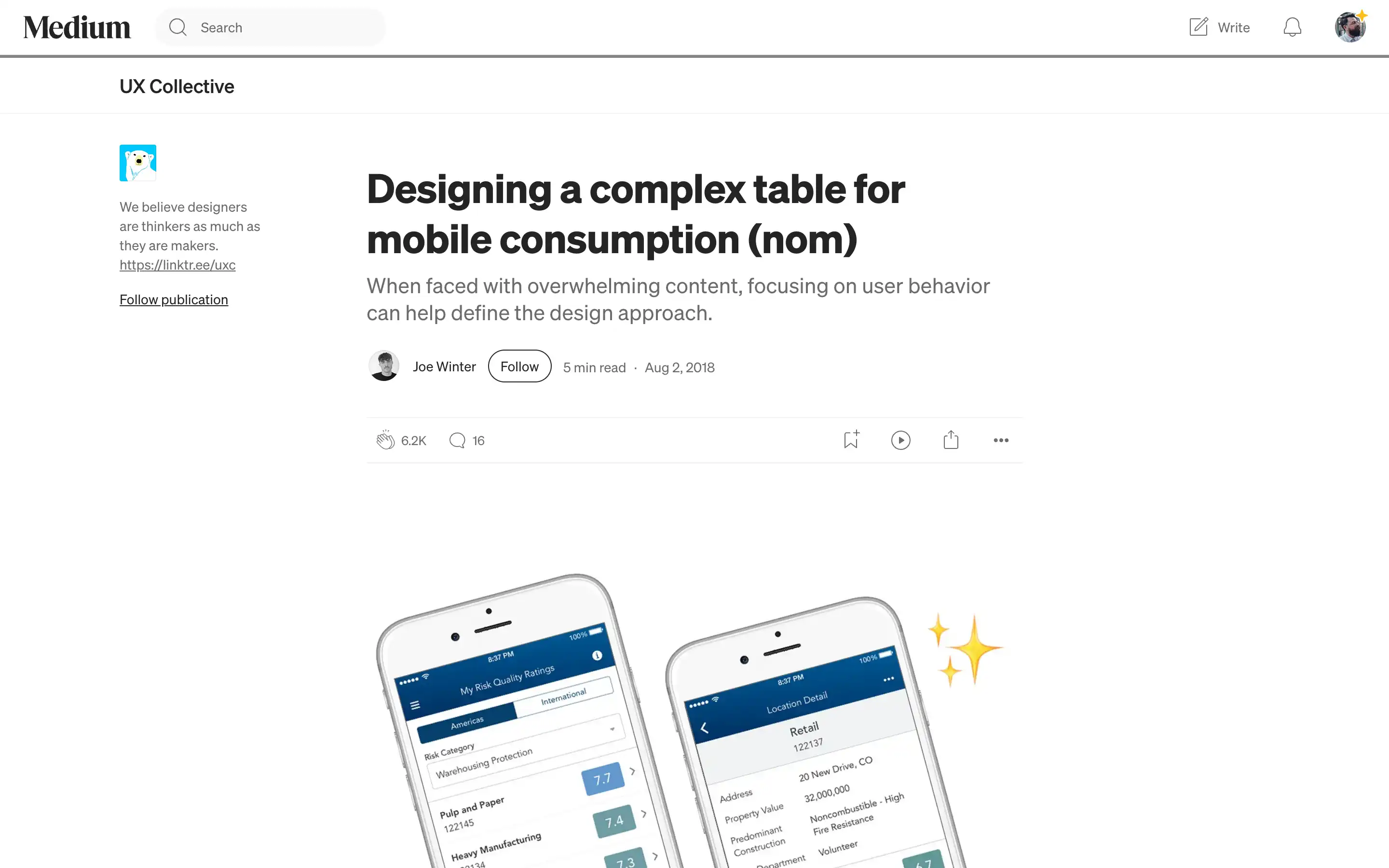
identifies two primary use cases: comparing a single risk category across multiple locations and multiple risk categories within a single location. By catering to these distinct user behaviors, the design approach evolves to provide a flexible and intuitive mobile experience.
The solution involves a “rotating table” concept, where users can select a specific risk category to view the corresponding values across locations. Additionally, tapping on a location row allows users to delve deeper and examine all risk categories for that particular site. Inspired by common workflows like timesheet entry, this design pattern offers a scalable and adaptable approach to presenting complex data on mobile devices.
Overall, this case study provides valuable insights into the challenges and solutions of designing complex tables for mobile consumption. It serves as a testament to the power of user-centric design. Focusing on how information is consumed can lead to innovative and effective solutions.


