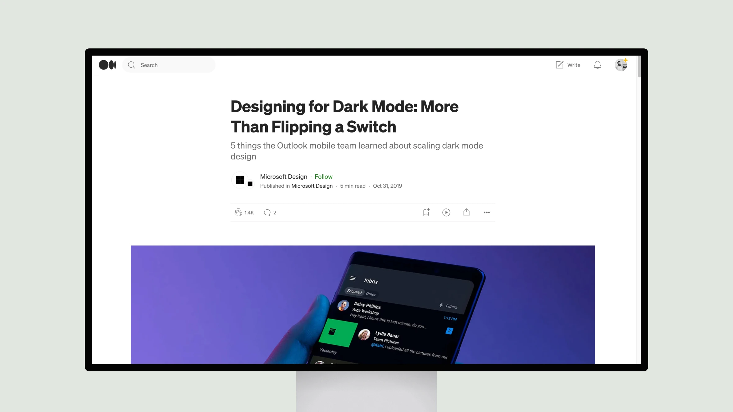
This article from Microsoft Design discusses best practices for implementing dark mode across an entire product line. Written by Wayne Sun and Joe Woodward of the Outlook mobile design team, it outlines the lessons they learned in scaling dark mode across Microsoft 365 applications on mobile.
The authors emphasize staying true to the core identity and purpose of each product while making the experience feel fresh in dark mode. They found that a pure black surface worked best for readability and battery life on mobile. Applying color required balancing distinction and accessibility through adjusted saturation levels.
A key insight was developing a semantic color system with single swatches assigned to multiple colors for light and dark versions. This approach kept the code clean and maintainable. Small details like updated icons and images were also important for full dark mode parity.
In summary, the article provides valuable guidance for designers tackling dark mode, including respecting the original product, considering mobile constraints, using color intentionally, and not forgetting important but subtle aspects of the design. The Outlook team’s experience successfully rolling out dark mode across a major product ecosystem offers useful lessons for implementing such an initiative.