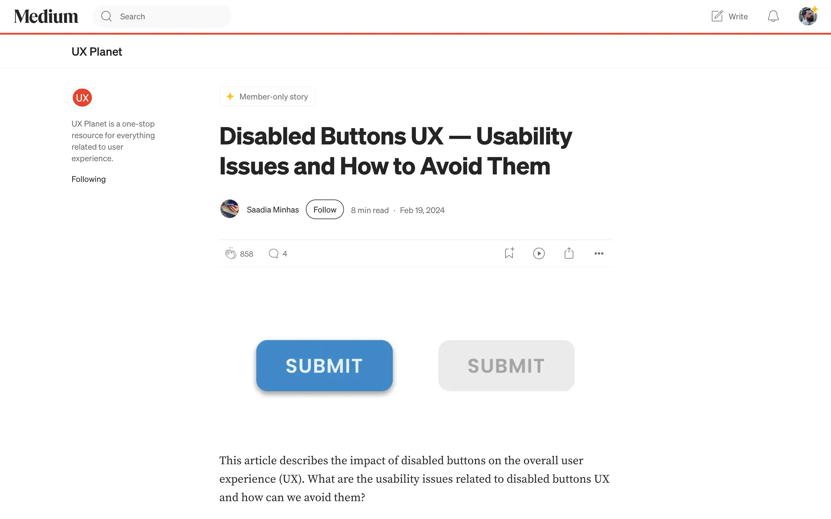
Disabled buttons can be a significant source of frustration for users, leading to a poor user experience. The article delves into the various usability issues associated with disabled buttons, such as confusion, broken experiences, accessibility challenges, and disrupted user flows.
Disabled buttons often fail to effectively communicate the reasons for their existence, leaving users unsure how to proceed. However, the article highlights scenarios where disabled buttons can be used effectively, such as in content management systems, collaboration apps, and editors, where the button’s disabled state is tied to an explicit user action or condition.


