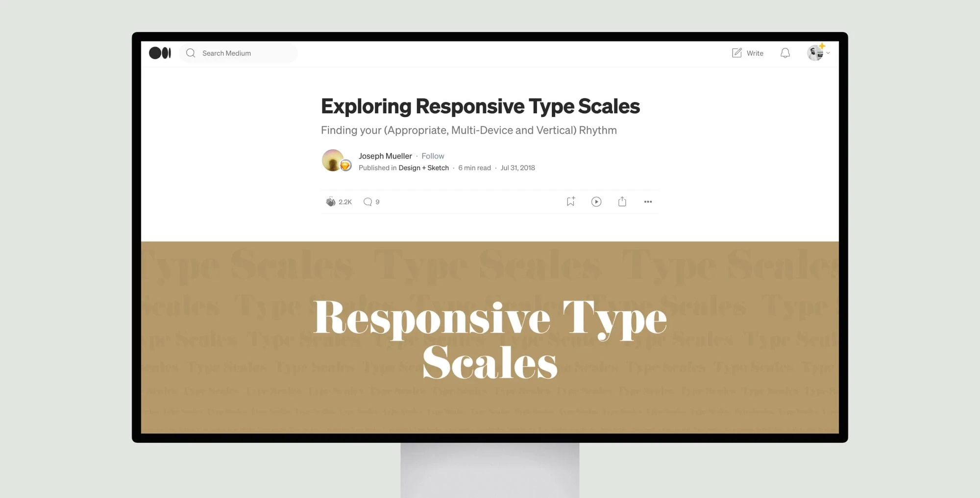
The article explores responsive typography and type scales, which are important considerations for multi-device web design. It discusses how different type scale ratios can significantly impact the size and spacing of text at different hierarchy levels. The author advocates selecting a type scale based on the website archetype – whether it’s for marketing, blogs, or products. Higher contrast scales work best for marketing sites, while lower contrast suits detailed products.
The piece also examines approaches for extending a single type scale across breakpoints for different screen sizes. Maintaining the same ratio risks text becoming too small or large on certain devices. Alternatively, using different scales – like a major second within pages and major third between breakpoints – can provide more flexibility.
In conclusion, understanding type scales allows for more efficient design work by reducing need to restart projects. Experimenting with various scales helps identify the optimal solution for each unique design challenge. Typography is fundamental to user experience, so taking time to “get it right” leads to enhanced clarity, readability and overall quality.
