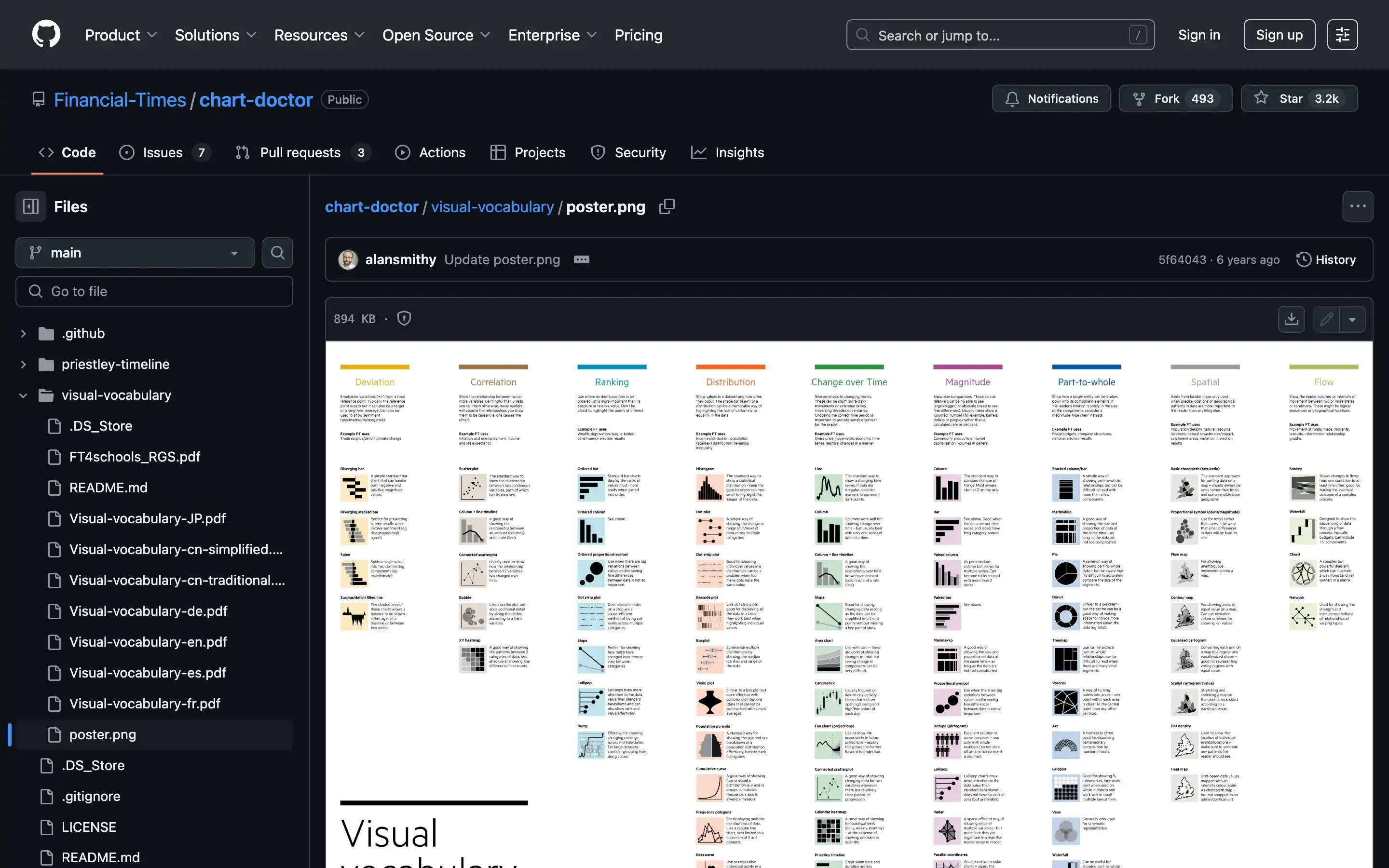
The Financial Times’ Visual Vocabulary Poster, available on GitHub, provides a guide for selecting the most effective chart or data visualization style for various data storytelling needs. Designed as a reference tool, the poster categorizes visualizations based on their purpose—such as comparison, distribution, correlation, change over time, and part-to-whole relationships—making it easy for users to identify the right type of visualization for their data.
This resource includes examples of over 40 chart types, ranging from simple bar charts to advanced scatter plots and heatmaps, with clear indications of their ideal use cases.


