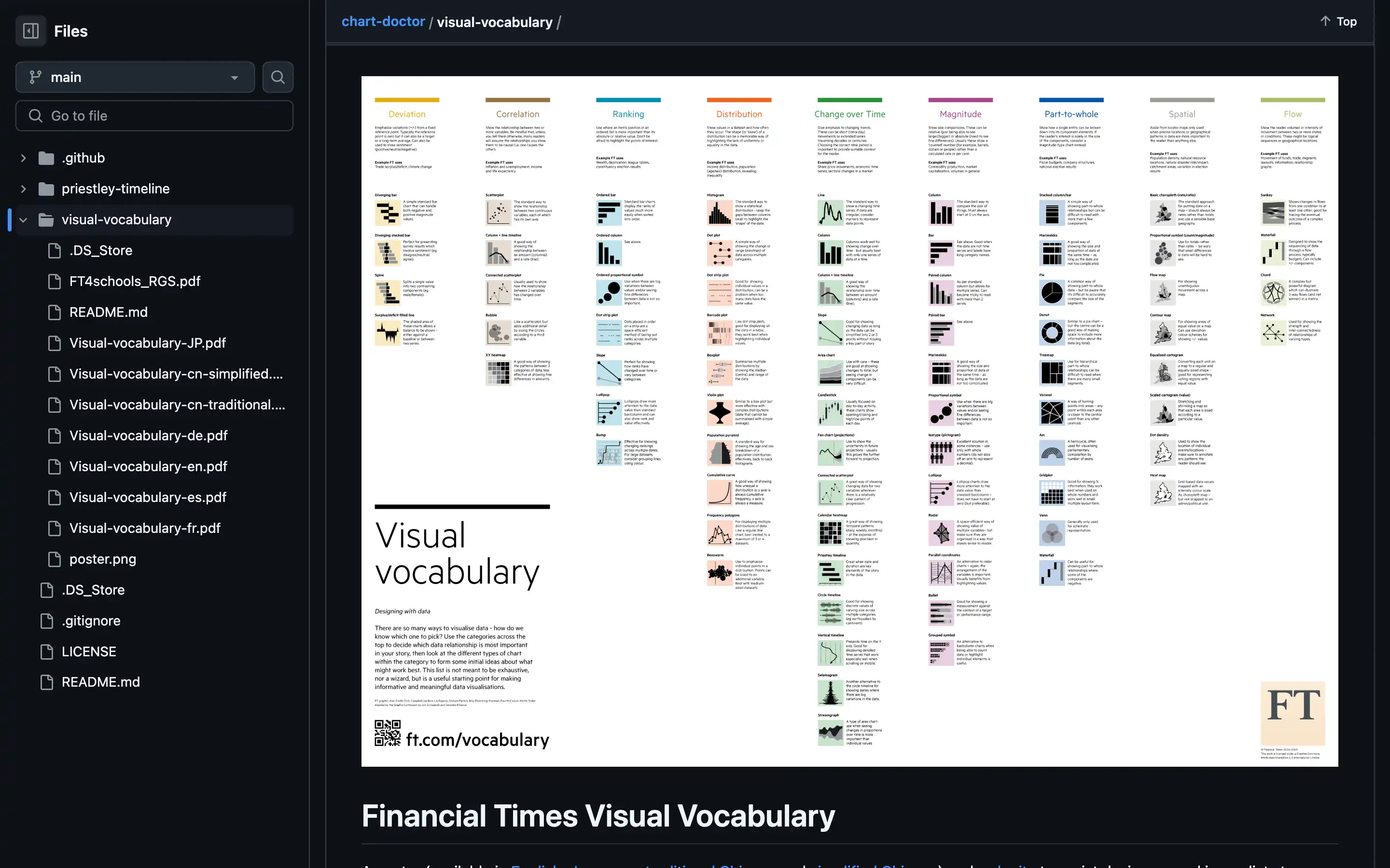
The Financial Times Visual Vocabulary is a comprehensive resource designed to assist designers and journalists in selecting the optimal symbology for data visualizations. Developed by the FT Visual Journalism Team, this poster and website provide information on various chart types, their applications, and best practices.
The Visual Vocabulary covers various chart categories, including Deviation, Correlation, Ranking, Distribution, Change over Time, Part-to-Whole, Magnitude, and Spatial. Each category is thoroughly explored, with detailed explanations, examples, and references to relevant research and industry experts.
The resource is not merely a collection of chart types but a guide to effective data storytelling. It emphasizes the importance of choosing the right visualization technique to convey the intended message rather than simply teaching everyone how to make charts. The content is inspired by Jon Schwabish and Severino Ribecca’s Graphic Continuum, which aims to bridge the gap between graphics and language.
Overall, the Financial Times Visual Vocabulary is a valuable resource for anyone involved in data visualization, whether they are designers, journalists, or data analysts. It offers a structured approach to chart selection and a wealth of knowledge to help create effective and engaging data stories.
