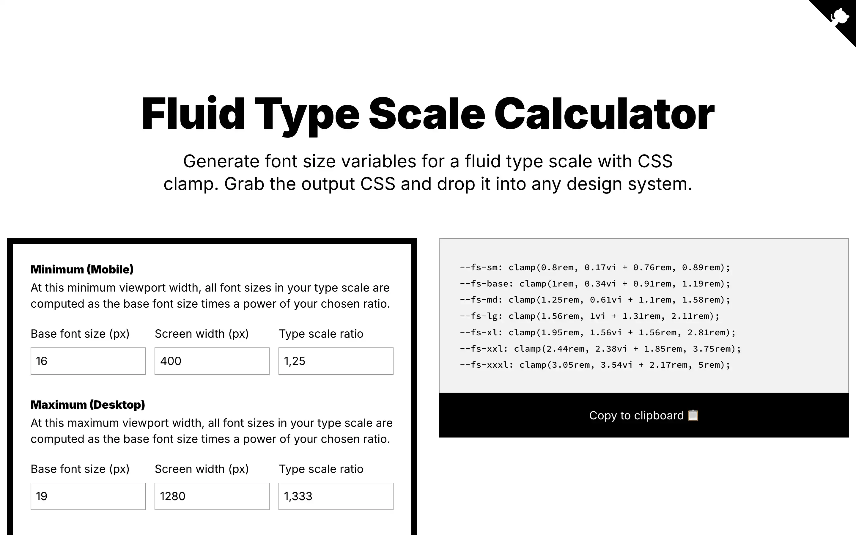
This handy tool allows you to generate responsive font sizes for your design system. A fluid type scale uses CSS clamp and viewport units to scale font sizes smoothly across device screens. You start by choosing a base font size and setting minimum and maximum viewport widths. Then, select a ratio to determine how each step in your type scale relates to the one before.
Just provide names for each step and pick your preferred units, rounding, and fallbacks. The generator calculates the CSS variables for each size using the clamp formula. This ensures text resizes nicely without jumps or cuts off. You can even preview the results on a simulated screen to see it in action.
Once satisfied, copy the output to use anywhere. Additional resources explain the math concepts in more detail.