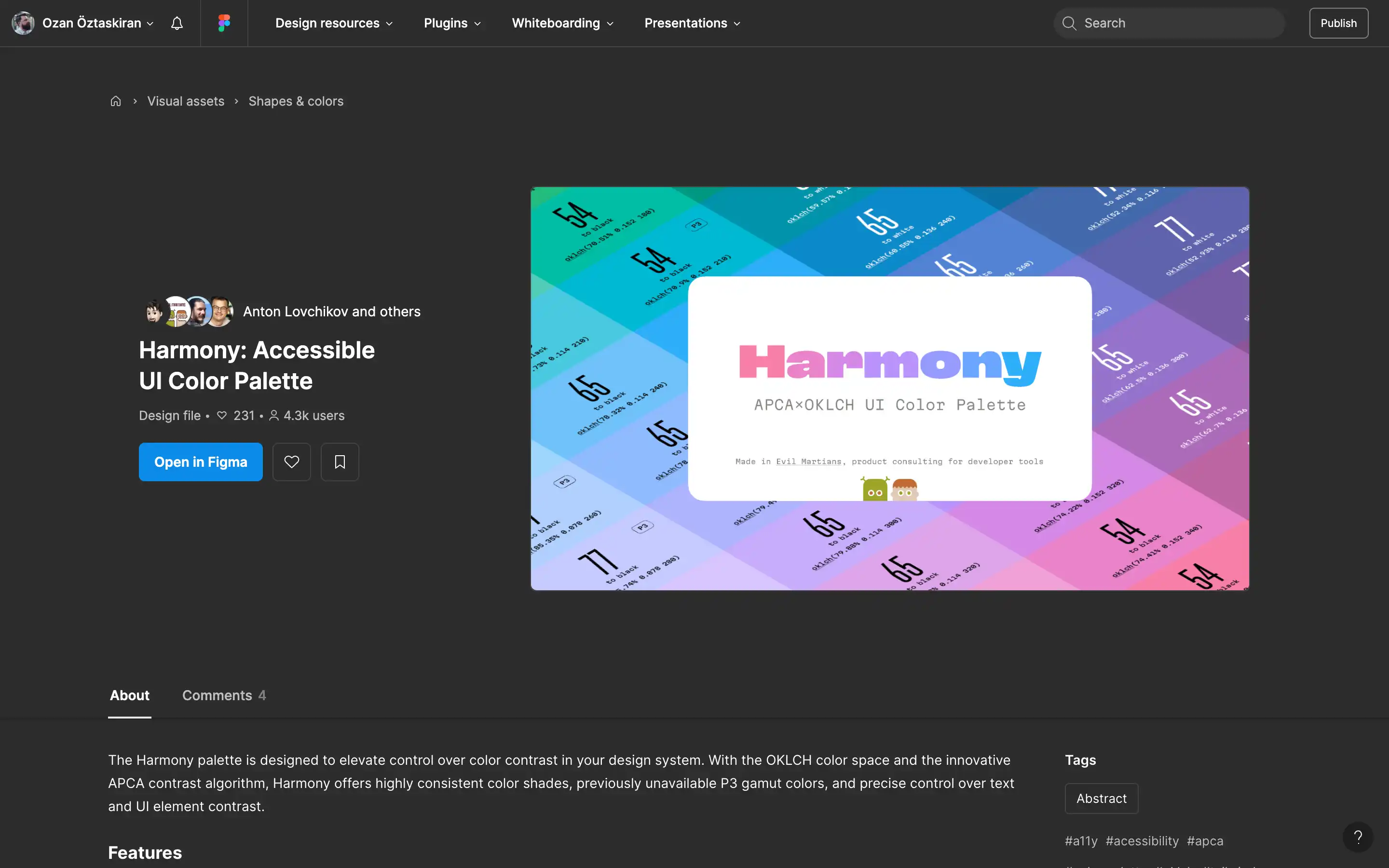
The Harmony palette is a powerful resource designed to enhance control over color contrast in design systems. It uses the OKLCH color space and the APCA contrast algorithm to provide consistent and readable color shades, improved access to P3 gamut colors, and precise contrast control for text and UI elements.
The palette ensures that switching between colors within the same lightness group (e.g., “600” shades of yellow, blue, and violet) retains readability, making color management more efficient and adaptable for diverse design scenarios.
Key features include mirrored contrast pairs for effortless theming between light and dark modes, APCA-compliant contrast levels for readability, and consistent chroma for visually distinct but semantically similar objects. The palette is compatible with Tailwind, supports the P3 gamut for vibrant colors, and provides Figma variables and OKLCH color codes to ensure seamless implementation between Figma and CSS.