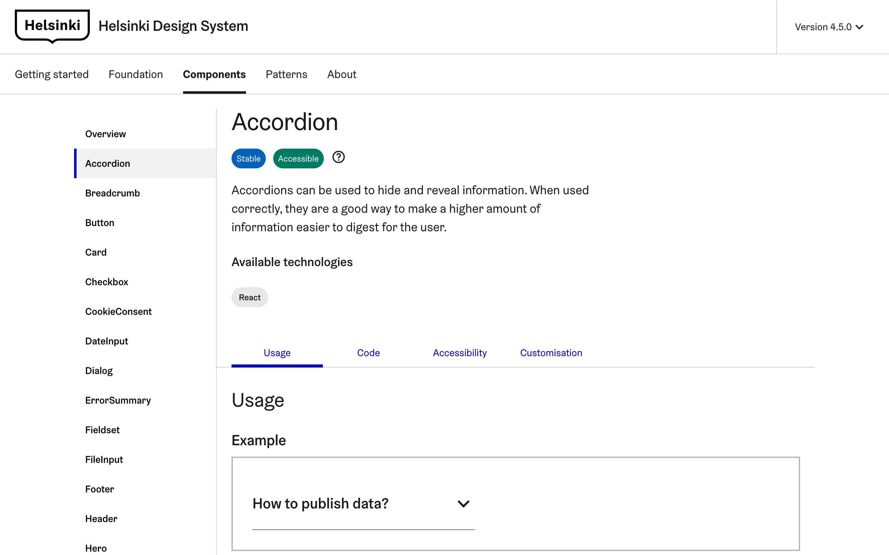
Accordions are versatile UI components that allow users to access and digest information quickly. The Helsinki Design System provides guidelines on properly using accordions to enhance the user experience.
The design system also outlines various accordion variations, such as default, card-based, and with the close button hidden. Developers are encouraged to choose the right accordion style based on the content and user needs. The guidelines emphasize judiciously using accordions to enhance content discoverability and user engagement.


