This informative article explores different methods for assigning color scales to data visualizations like choropleth maps. Written by Lisa Charlotte Muth of the Datawrapper team, it examines the impact of interpolation choices on how data is perceived.
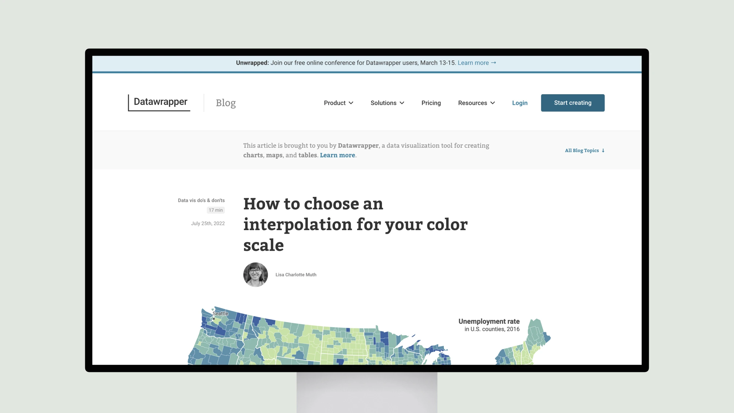
Muth outlines various interpolation options for both stepped and continuous color scales, demonstrating through unemployment data how distributions influence the best approach. Linear and rounded interpolations work well for even distributions but fail to show differences for outliers. Quantile methods distribute colors evenly but may overstate outliers.
Natural breaks interpolation balances showing outliers while grouping similar values. Custom interpolation offers flexibility, like rounding for readability. Median, quartile and other quantile options for continuous scales effectively “stretch” the gradient to use more colors.
Overall, the article provides valuable guidance on understanding data distributions and choosing interpolations that achieve the right balance of truthfulness and usefulness. Readers learn how interpolation method profoundly shapes communication and comprehension of visualized information.


