This insightful article by Teresa Man of Superhuman provides valuable guidance on designing dark themes that are readable and user-friendly. As more apps adopt dark modes, it is important to thoughtfully develop color palettes and contrast levels that reduce eye strain in various lighting conditions.
The author outlines strategic approaches like using darker shades for distant elements and lighter tones for foreground surfaces to mimic natural lighting. Perceptual contrast is also key – slight adjustments can meaningfully impact fatigue. Large blocks of bright color should be minimized to avoid distraction from important content. True black and white are best avoided due to realism, smearing, depth perception, and halation concerns.
Finally, colors need deepening by reducing lightness and boosting saturation to work harmoniously alongside text. Overall, this article presents a well-researched framework for crafting dark themes that are visually balanced and delightful to use.
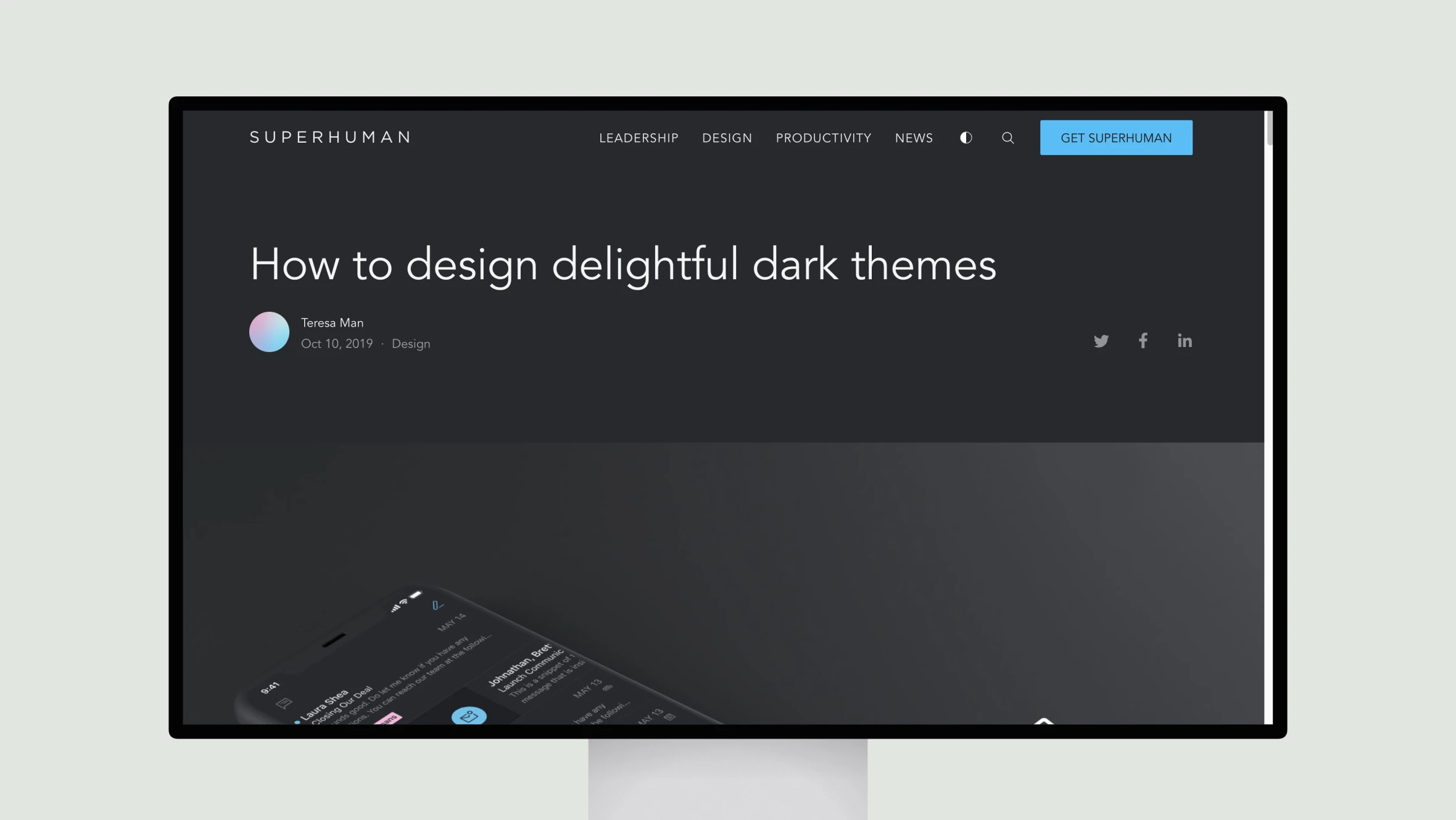
How to design delightful dark themes
Teresa Man provides strategies for designing user-friendly dark themes, focusing on contrast, color balance, and reducing eye strain.
Topic(s):
Added on:
UI & UX design inspiration for mobile & web apps.


