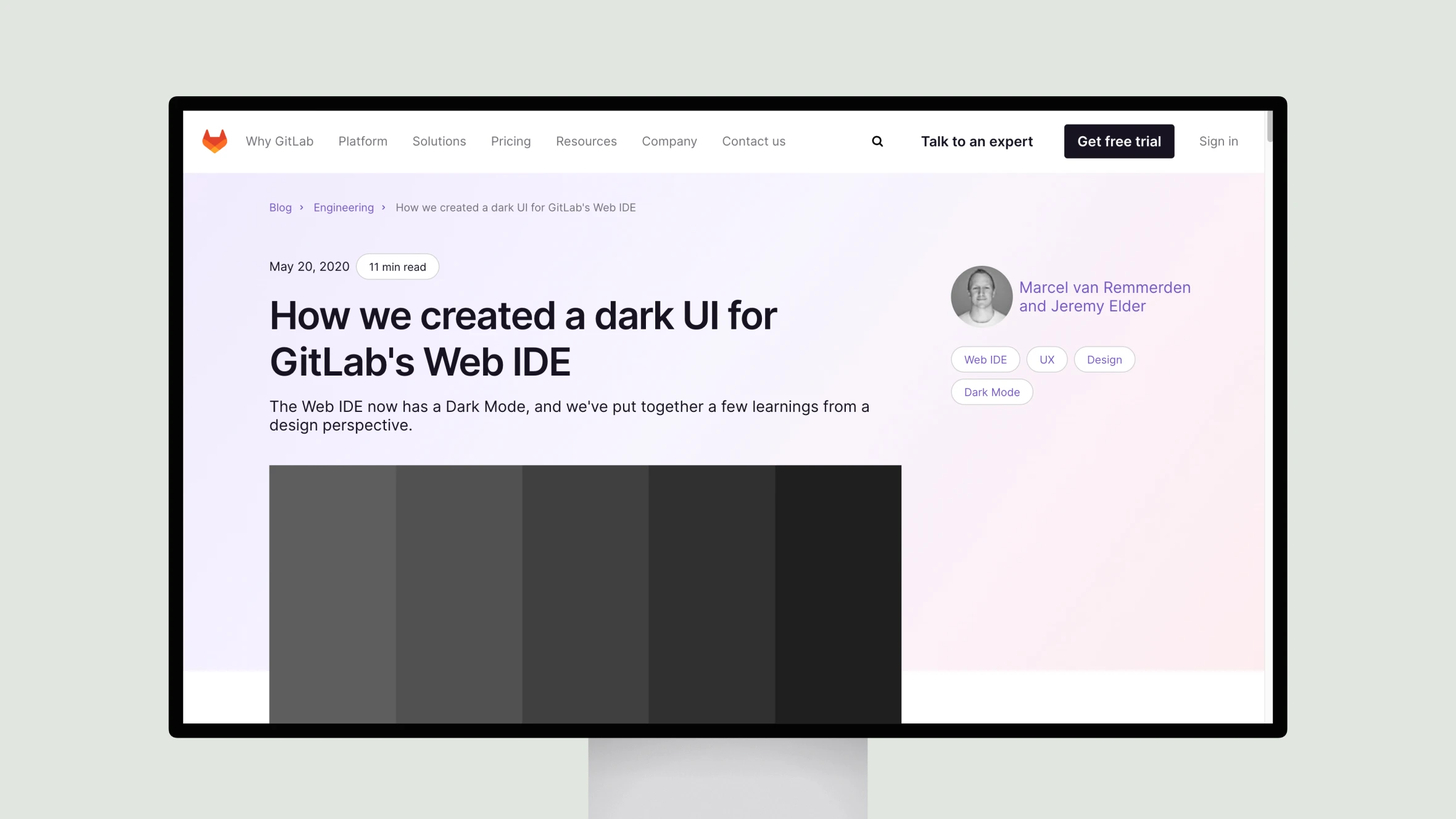
GitLab designers Marcel van Remmerden and Jeremy Elder share their process for creating a dark mode interface for the company’s Web IDE tool. They discuss how they approached the challenge of adapting elements like syntax highlighting, buttons, and tabs for a dark theme while maintaining usability.
The designers explain how they used Figma for collaborative prototyping and asynchronous feedback. They provide useful examples comparing light and dark versions of UI elements. Van Remmerden and Elder also outline their iterative approach to rolling out pieces of the dark mode, getting feedback, and continually improving.
Some valuable lessons covered include addressing state changes, leveraging color systems, and standing on the shoulders of leaders like Apple and Material Design. The designers conclude by discussing plans to clean up their prototype and make the Web IDE code more theme-friendly. An inspiring read for any teams tackling dark mode interfaces.


