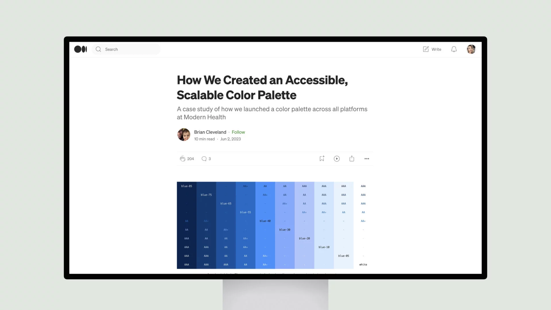
How Modern Health created an accessible and scalable color palette across their digital products. They started with an unstructured set of colors that led to inconsistencies. The author conducted an audit that found low color contrast and single-use hex values.
The first palette organized colors by lightness but didn’t scale well. The author then explored the HSLuv color model, which models lightness in a way that matches human perception better than HSL. Goals for the new palette included centralization, accessibility, clear naming, and the ability to scale over time.
The new palette placed colors in groups along a lightness scale in HSLuv. This ensured consistent color contrast ratios regardless of hue. Names followed a numeric scale like “blue-05” for readability. Guidelines provided standards for text contrast and common UI colors.
