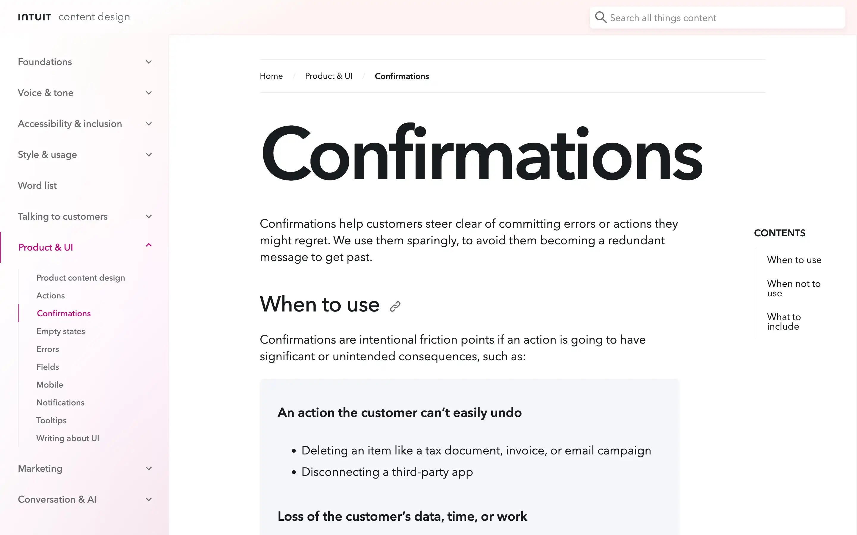
Confirmations are essential to the user experience, helping customers avoid costly mistakes or unintended actions. Intuit outlines when to use confirmations, what to include, and how to craft them effectively.
Confirmations should be used sparingly, only for actions with significant consequences that the user can’t easily undo, such as deleting important data or disconnecting third-party apps.
The key components of an effective confirmation are a concise title, informative body copy, and clear call-to-action buttons. The title should directly address the action, using specific details where possible. The body should explain the consequences and whether the action can be undone. The CTAs should allow the customer to either proceed or cancel the action.
Confirmations should be thoughtfully designed to minimize cognitive burden and provide a smooth decision-making process. Avoid vague or alarmist language and focus on empowering the customer to make an informed choice. Confirmations can enhance trust and prevent costly mistakes by striking the right balance of friction and clarity.


