Flexbox makes it easy to create complex and responsive designs, making it an essential skill for any web developer.
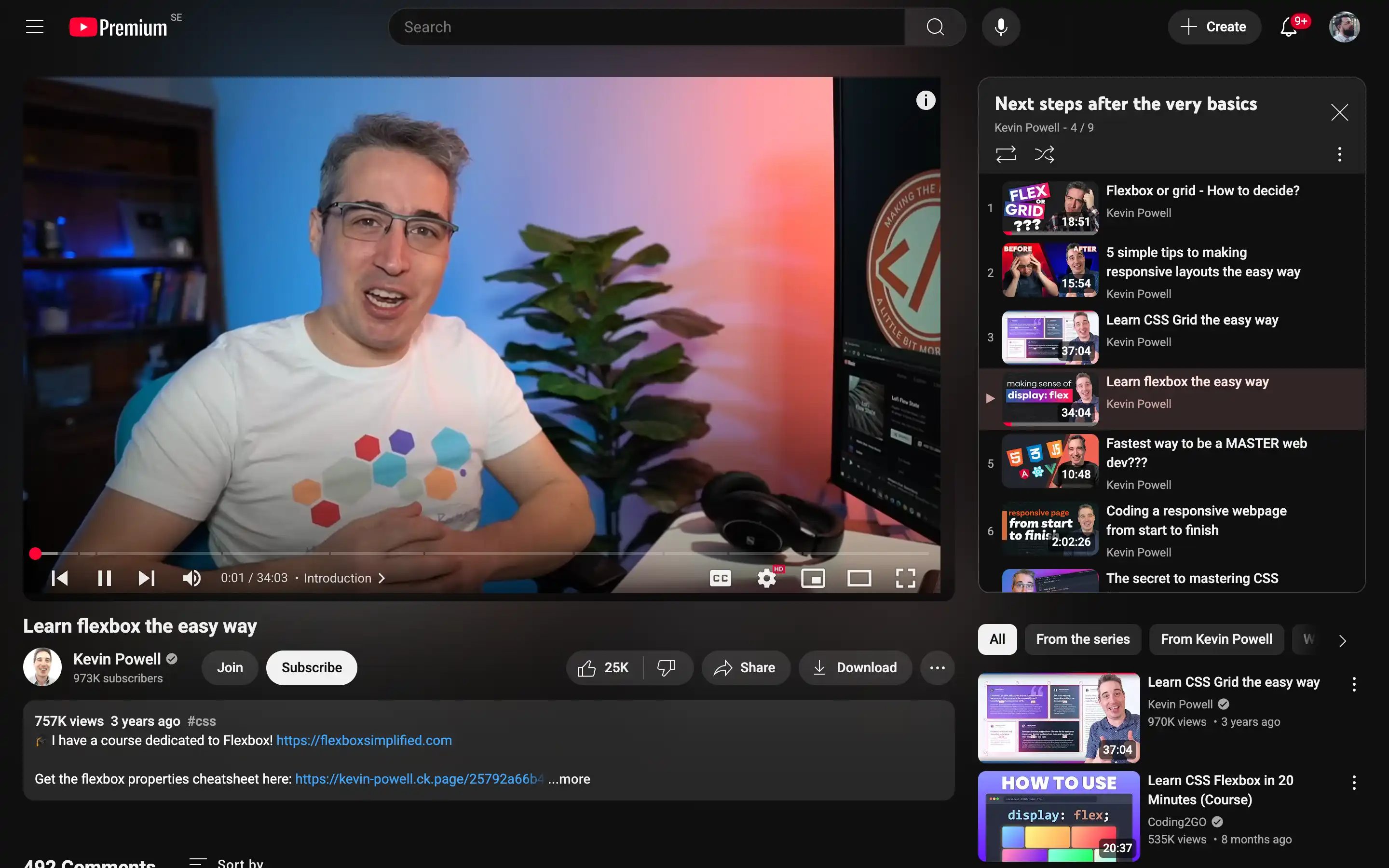
The video introduces the basics of Flexbox, explaining what happens when you declare display: flex on a container. It then delves into the various properties that make Flexbox so versatile, such as flex-grow, which allows you to control how elements expand within the available space.
One of the key challenges addressed is dealing with more content than the container can accommodate. The video demonstrates using Flexbox to create even columns, ensuring a consistent layout regardless of the content’s length. Additionally, it covers the flex-direction property, which allows you to change the direction of the Flexbox layout, and justify-content, which controls the alignment of elements along the central axis.
