Tetsuro Takara’s article on his experience building a solution for Shopify’s Reports team provides valuable insights that any designer can learn from.
Takara’s first key lesson is to avoid becoming too attached to your prototypes. While they can help demonstrate an idea, they shouldn’t be treated as the final implementation. His initial prototype, which used a JavaScript plugin to achieve the desired swiping effect, had major accessibility issues due to its non-semantic markup.
Another important lesson is to be mindful of how CSS can impact screen readers. Takara encountered several unexpected problems, like visually hiding columns and breaking keyboard commands that screen reader users rely on. Regular testing is crucial to catch these kinds of quirks.
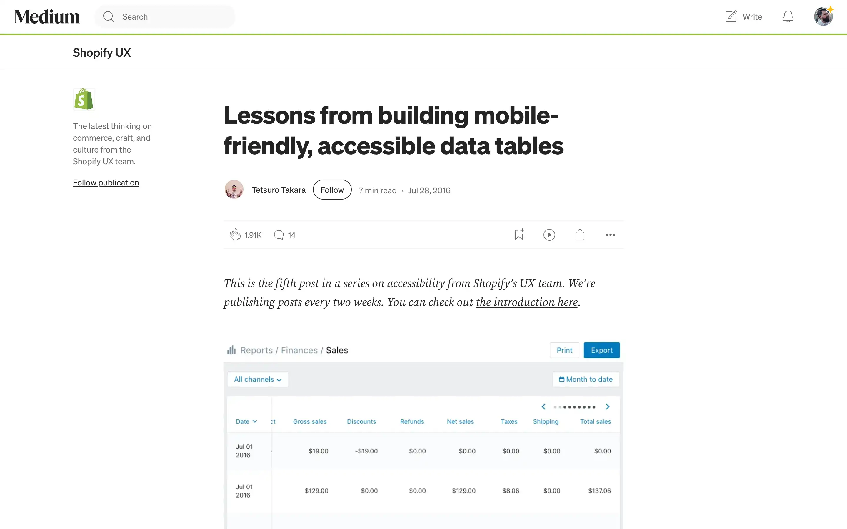
Perhaps Takara’s most valuable insight is the importance of sticking to semantic HTML. By using two tables—one visually hidden from screen readers—he achieved the desired mobile-friendly design while maintaining accessibility.
The overarching theme here is that accessibility should be a priority from the start of a project, not an afterthought. Takara’s lessons demonstrate how taking the time to build inclusive experiences can lead to better solutions for all users, regardless of their abilities or device preferences.


