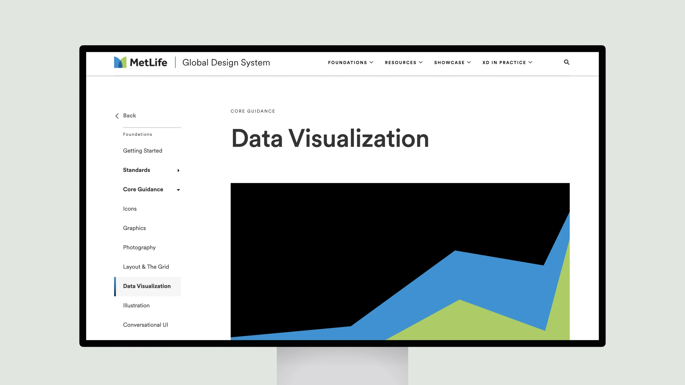
MetLife’s Data Visualization guidelines provide detailed strategies for creating visuals that present data in an accessible and visually cohesive way. The resource focuses on selecting the right chart types for specific data needs, such as pie charts illustrating proportions or bar charts comparing values. This ensures that visuals are both functional and easy to understand.
Color is a central theme in the guidelines, with predefined palettes designed to enhance readability while adhering to accessibility standards. Accessibility is woven into every aspect of the guidelines, with tips for maintaining contrast, offering alternative data formats, and ensuring compatibility with screen readers and keyboard navigation. These principles create a framework for visualizations that are inclusive, professional, and tailored to the needs of a diverse audience.