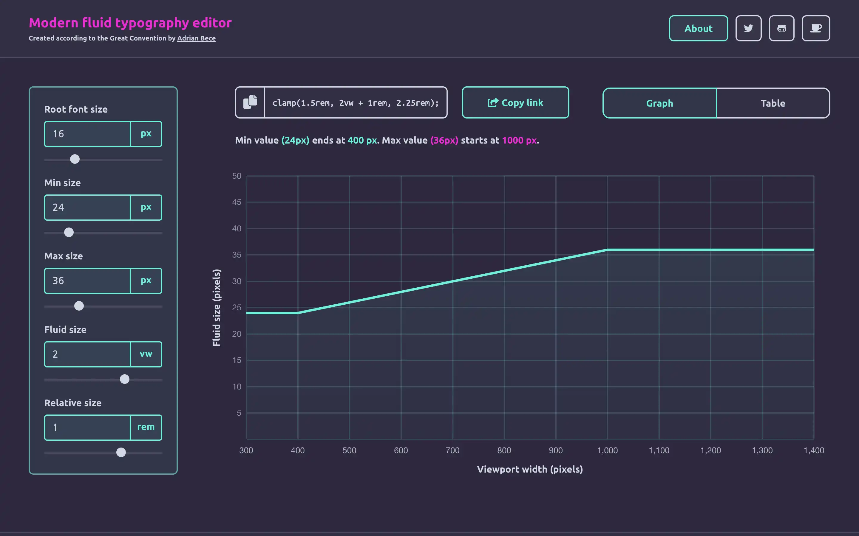
Fluid typography is a modern way of approaching responsive typography. Instead of setting fixed typography values for individual screen sizes, we can set a single fluid value and let the CSS render the appropriate values for a specific screen size constrained by minimum and maximum values.
Try resizing the screen and notice how the “About the project & user guide” adapts to screen size, but is constrained at some specific minimum and maximum value. Cool, isn’t it?
This editor relies heavily on CSS clamp and generates code using this property. Although this property has a solid browser support (above 90% of globally used browsers), you might want to use a polyfill or a fallback value if you need to support legacy browsers like Internet Explorer.