Molly has put in the hard yards, testing and retesting various approaches, and she’s generously sharing her hard-won lessons with the community.
The key takeaways here are:
- Use “weak” and “strong” to describe color contrast rather than “light” and “dark,” which can become confusing when dealing with multiple modes.
- Only add the colors you’re using in your design system – no need to clutter things up with unused color scales.
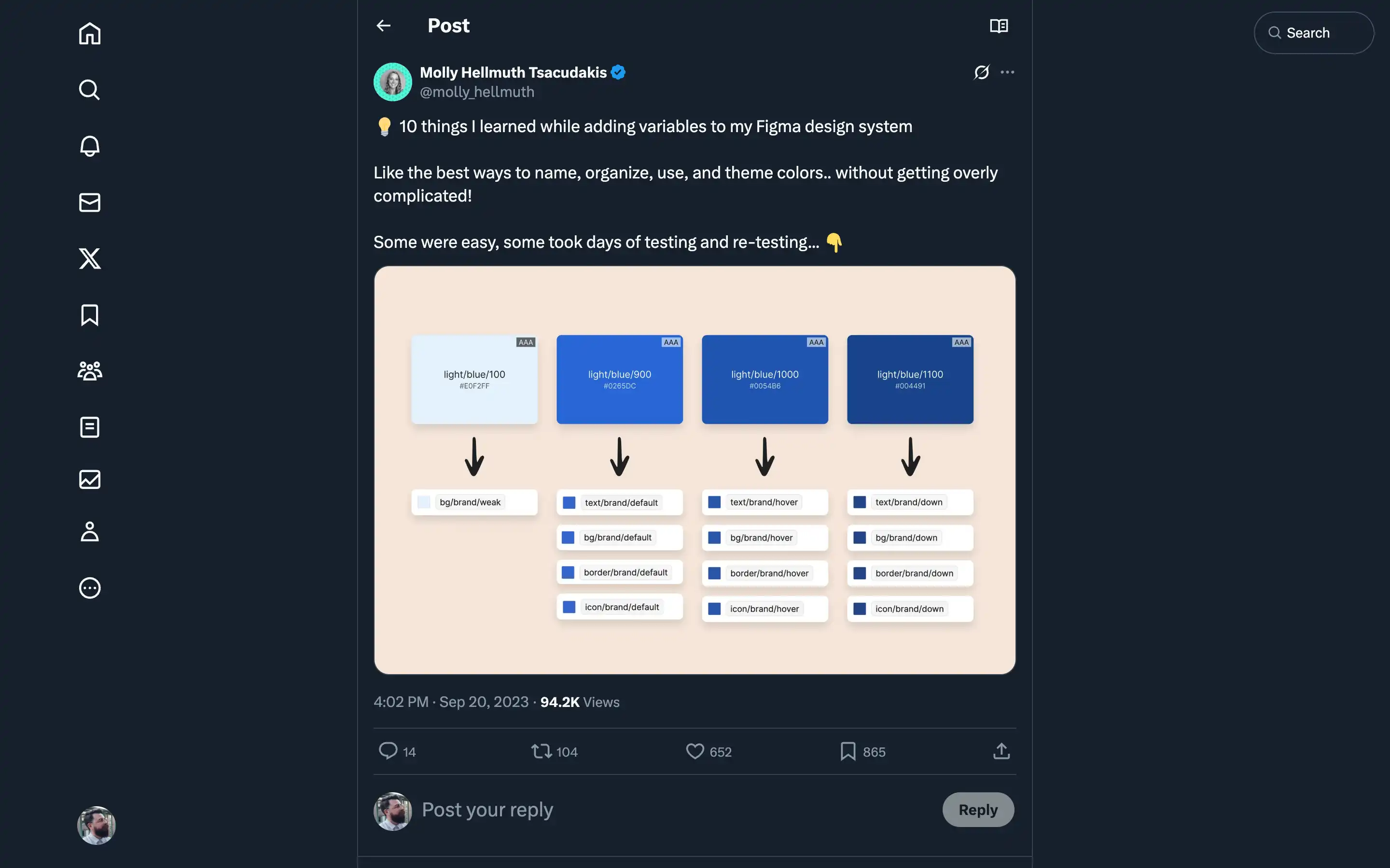
- Stick to global, semantic variables like “bg/brand/default” rather than component-specific ones, at least to start.
- Maintain two separate color collections – one for primitive colors like “green/900” and another for semantic colors referencing the primitives.
Molly’s advice is practical, battle-tested, and sure to save designers a ton of time and headaches. Whether building a new design system from scratch or refining an existing one, these tips are pure gold.


