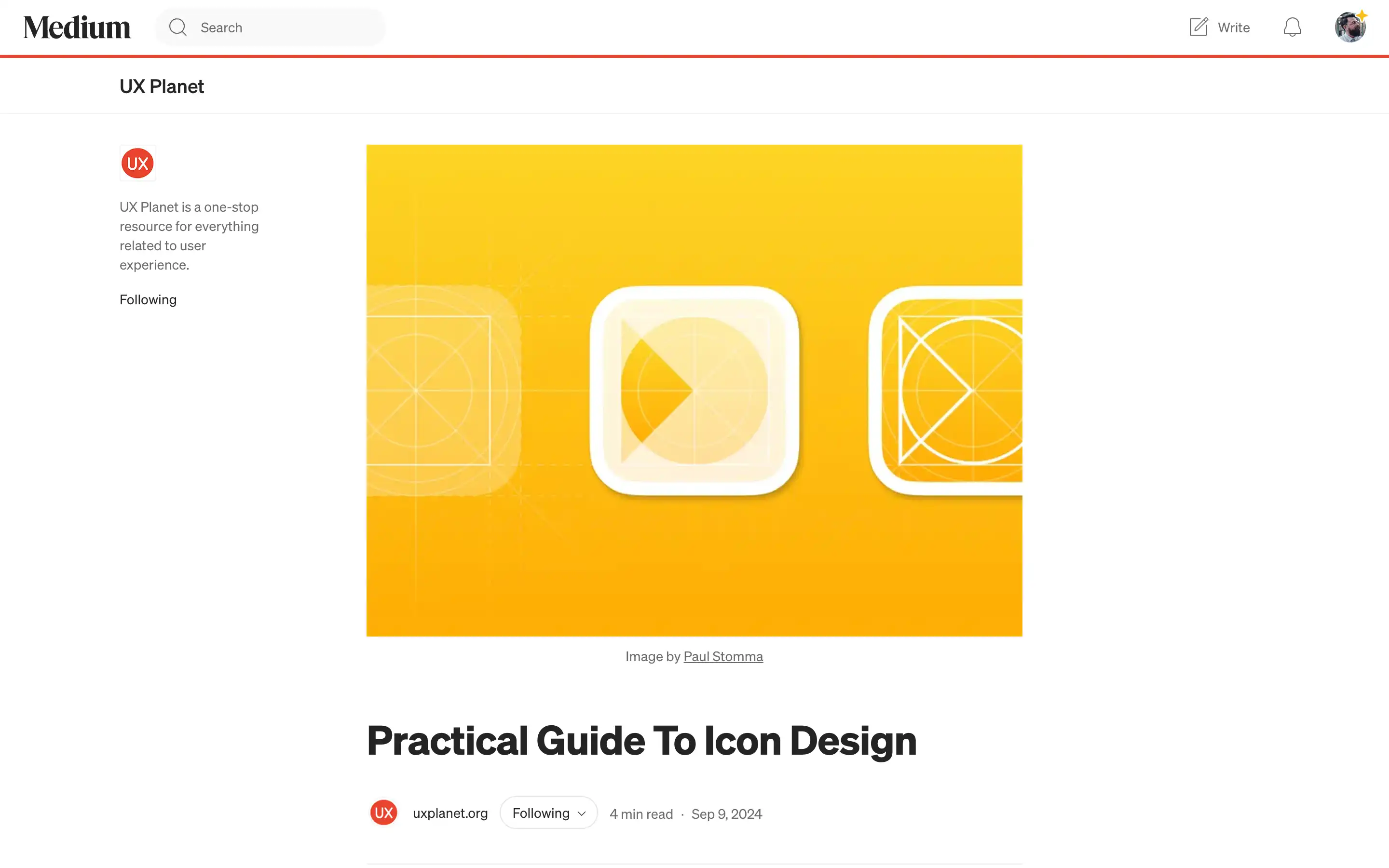
UX Planet’s “Practical Guide to Icon Design” is a straightforward and practical resource for designers looking to create clear, functional, and visually appealing icons. The article focuses on making icons that don’t just look good but also improve usability. It walks readers through essential tips, like keeping icon styles consistent, testing them at various sizes, and ensuring they’re easy to understand at a glance. The advice feels like a friendly guide from an experienced designer, offering real-world solutions to common icon design challenges.
One of the standout takeaways is the emphasis on pixel-perfect accuracy—aligning icons to a grid, working at 100% scale, and using consistent stroke widths to maintain a polished look. The guide also suggests creating icons in multiple sizes to fit different screens and UI elements while keeping things simple for smaller versions to ensure clarity. With advice on balancing icons with typography and using keylines for visual harmony, this guide is packed with practical tips for anyone wanting to design icons as effective as beautiful.


