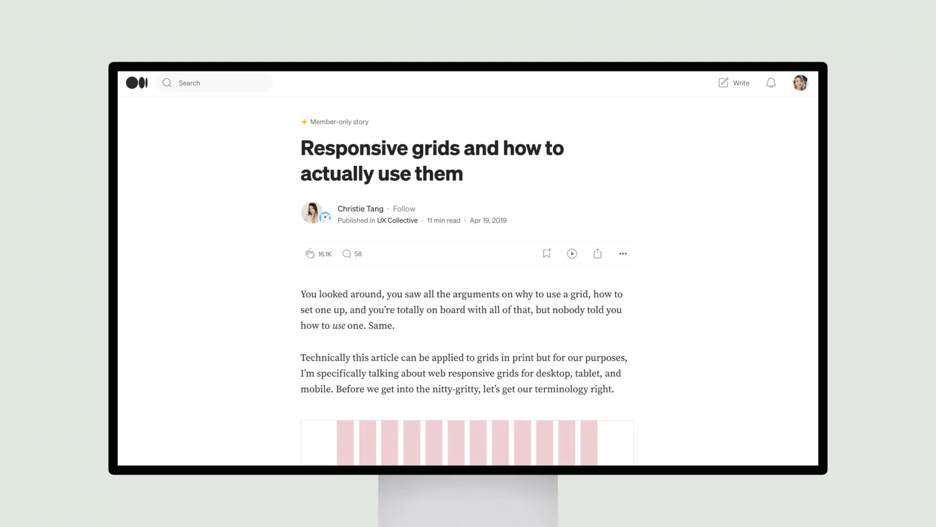
Christie Tang delves into the nuances of grid-based layouts, offering a clear understanding of the key components – field elements, columns, and gutters.
The article emphasizes the importance of choosing the right column width, as this decision can significantly impact the overall design. It also highlights the common UI layouts that can be achieved through the strategic application of responsive grids, catering to various device sizes and user preferences.
Notably, the author addresses the common challenges designers face when transitioning from static to dynamic grid systems, providing practical solutions and design principles to ensure a seamless user experience across different platforms.
Overall, this is a valuable resource for designers and developers seeking to elevate their web design skills and create visually appealing, responsive layouts that cater to the diverse needs of modern users.


