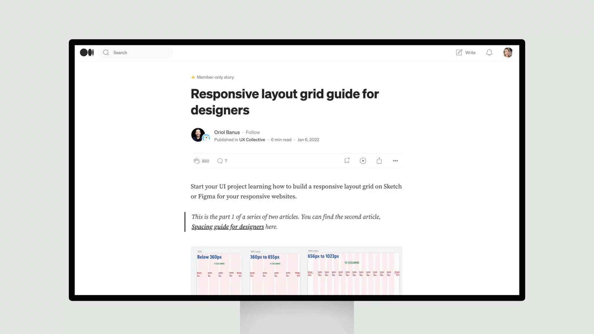
Oriol Banus delves deep into the principles of layout design, emphasizing the importance of balance, responsiveness, and standardization.
The crux of the matter lies in the 8px grid system, a foundational approach that ensures consistency and harmony across all elements, from typography to iconography. By adhering to this grid, designers can effortlessly arrange visual components in a way that seamlessly adjusts to various screen sizes, delivering a cohesive user experience.
Banus meticulously outlines the benefits of this approach, making it clear that a well-designed grid system is the backbone of any successful, responsive website. Whether you’re a seasoned pro or a budding designer, this guide provides invaluable insights that will elevate your skills and help you create truly remarkable digital experiences.


