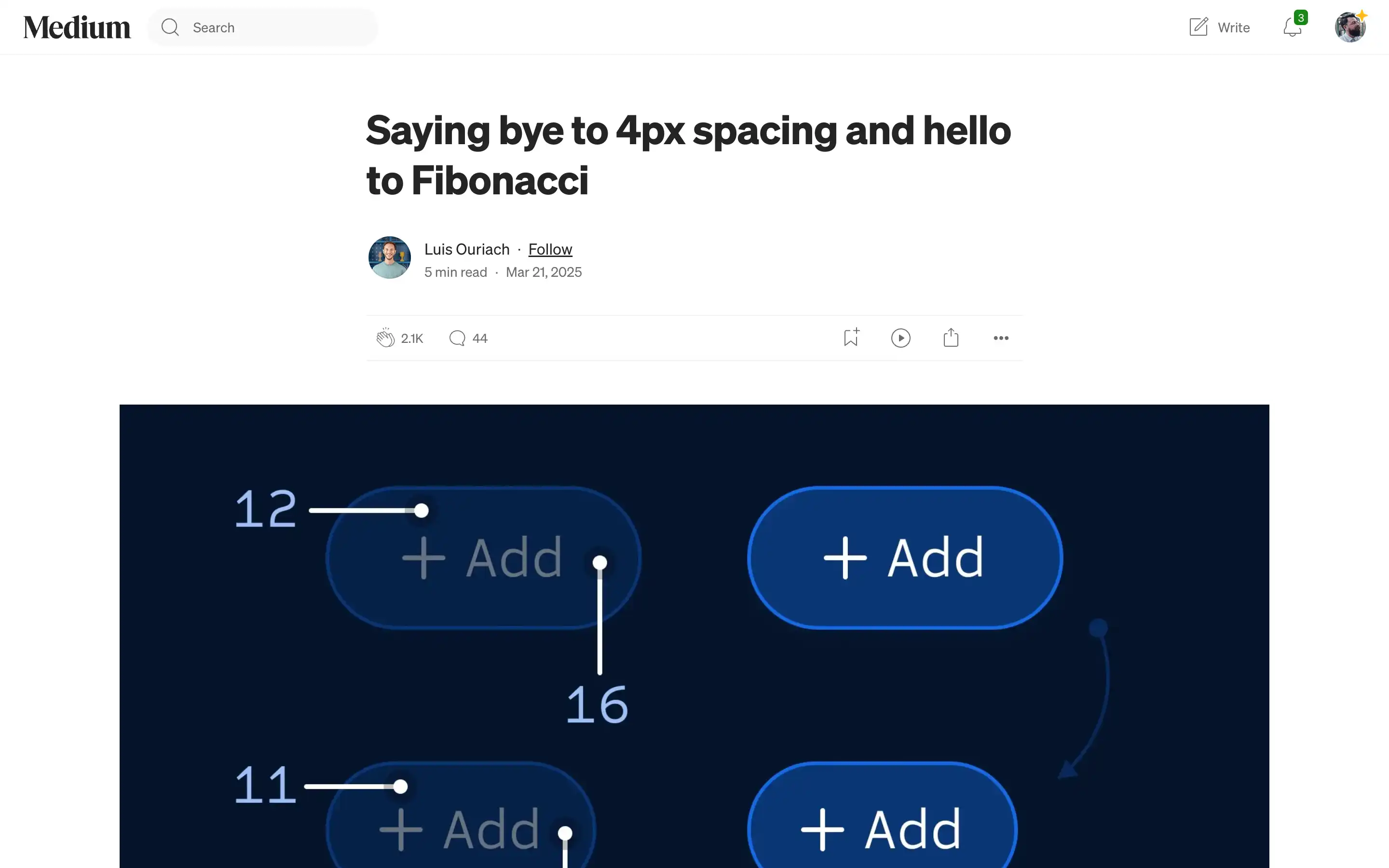
Luis Ouriach critiques the conventional 4px spacing grid commonly used in digital design. He observes that while this system promotes consistency and efficiency, it often results in monotonous and predictable layouts. To introduce more visual interest and harmony, Ouriach proposes adopting a spacing system based on the Fibonacci sequence. 
The Fibonacci sequence, characterized by each number being the sum of the two preceding ones (e.g., 1, 2, 3, 5, 8, 13, 21), offers a non-linear progression that can create more dynamic and aesthetically pleasing designs. Ouriach suggests that using odd-numbered spacing values derived from this sequence can lead to tighter and more balanced compositions, especially when combined with even-sized fonts and icons. He references Notion’s design approach as an example of effectively mixing even and odd spacing values to achieve visual harmony. While acknowledging that this method may require more manual adjustments, Ouriach believes that incorporating the Fibonacci sequence into design systems can enhance the overall user experience by adding subtle variations and rhythm to layouts.


