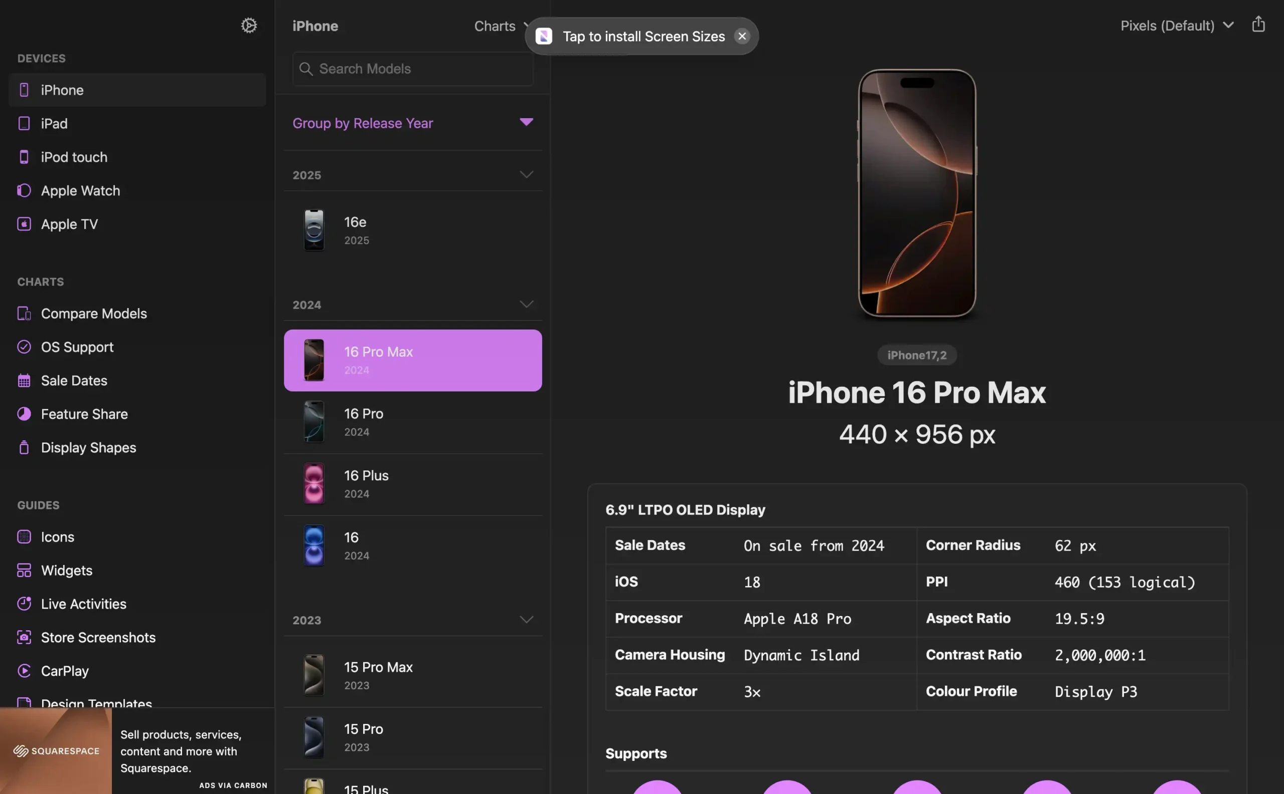
ScreenSizes is a tool that provides designers and developers with an up-to-date database of device screen specifications, including resolutions, physical sizes, and aspect ratios. The resource covers a wide range of devices, from smartphones and tablets to desktop monitors, helping users create responsive and device-specific designs.
This tool is particularly valuable for those developing cross-platform applications or responsive websites, as it ensures accurate layout and scaling across different screen types. ScreenSizes simplifies the design process by allowing quick reference to device specs, supporting optimized visuals and functionality for diverse screen dimensions.