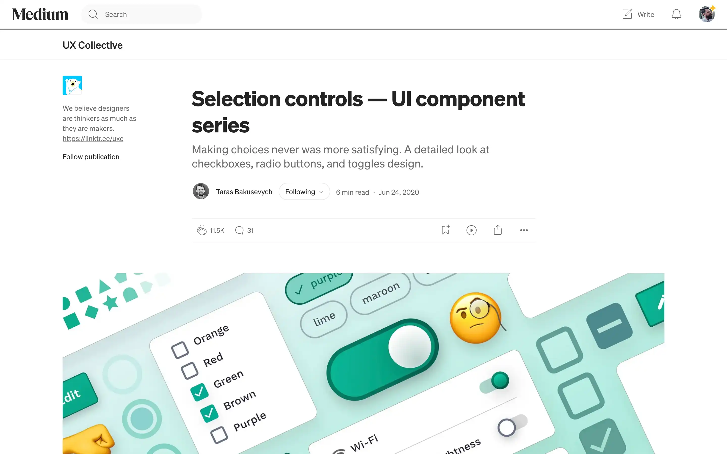
Taras Bakusevych examines the design and application of selection controls, specifically checkboxes, radio buttons, and toggle switches. He explains that checkboxes enable users to select multiple independent options, radio buttons allow for a single selection among mutually exclusive choices, and toggle switches facilitate immediate on/off actions.
Bakusevych emphasizes the importance of adhering to standard design practices to meet user expectations, cautioning against unconventional styling that might cause confusion. He also notes that presenting options in a vertical list enhances scanability and suggests using chips when vertical space is limited. Additionally, he recommends opting for radio buttons over drop-down menus to reduce cognitive load and improve form transparency.


