Let’s dive in, shall we?
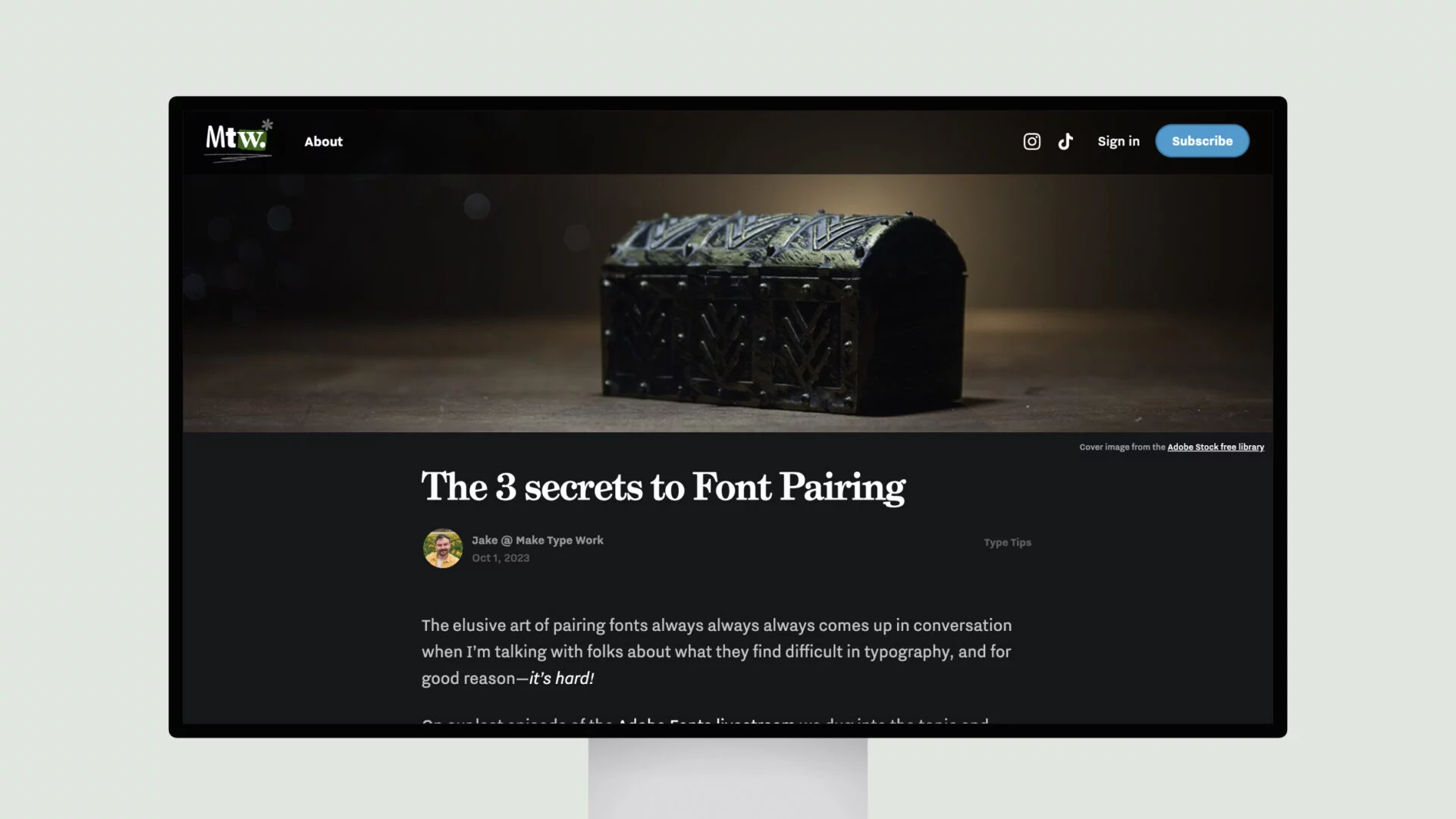
First and foremost, the author emphasizes the importance of establishing an “Anchor Font.” This is the foundation upon which you’ll build your pairing. It could be the font you’ve chosen for your body copy, headings, or even a branding element. The key is to use this as the starting point and let it guide the rest of your decisions.
Next, the author delves into the delicate balance of “Contrast vs. Similarity.” This is where the real magic happens. You want to find fonts that share enough common ground to create a cohesive look and feel but also possess enough contrast to add visual interest. It’s a fine line to walk, but the author provides clear guidance on how to strike the right balance.
Finally, the author underscores the importance of considering both the “Emotion” and “Job” of your font pairing. Fonts aren’t just tools; they have the power to evoke specific emotions and convey the right tone for your design. By keeping these factors in mind, you can ensure your typography not only looks great but also resonates with your audience on a deeper level.
So, what are you waiting for? Dive in, put these three secrets to the test, and watch as your font pairings transform from ordinary to extraordinary.
