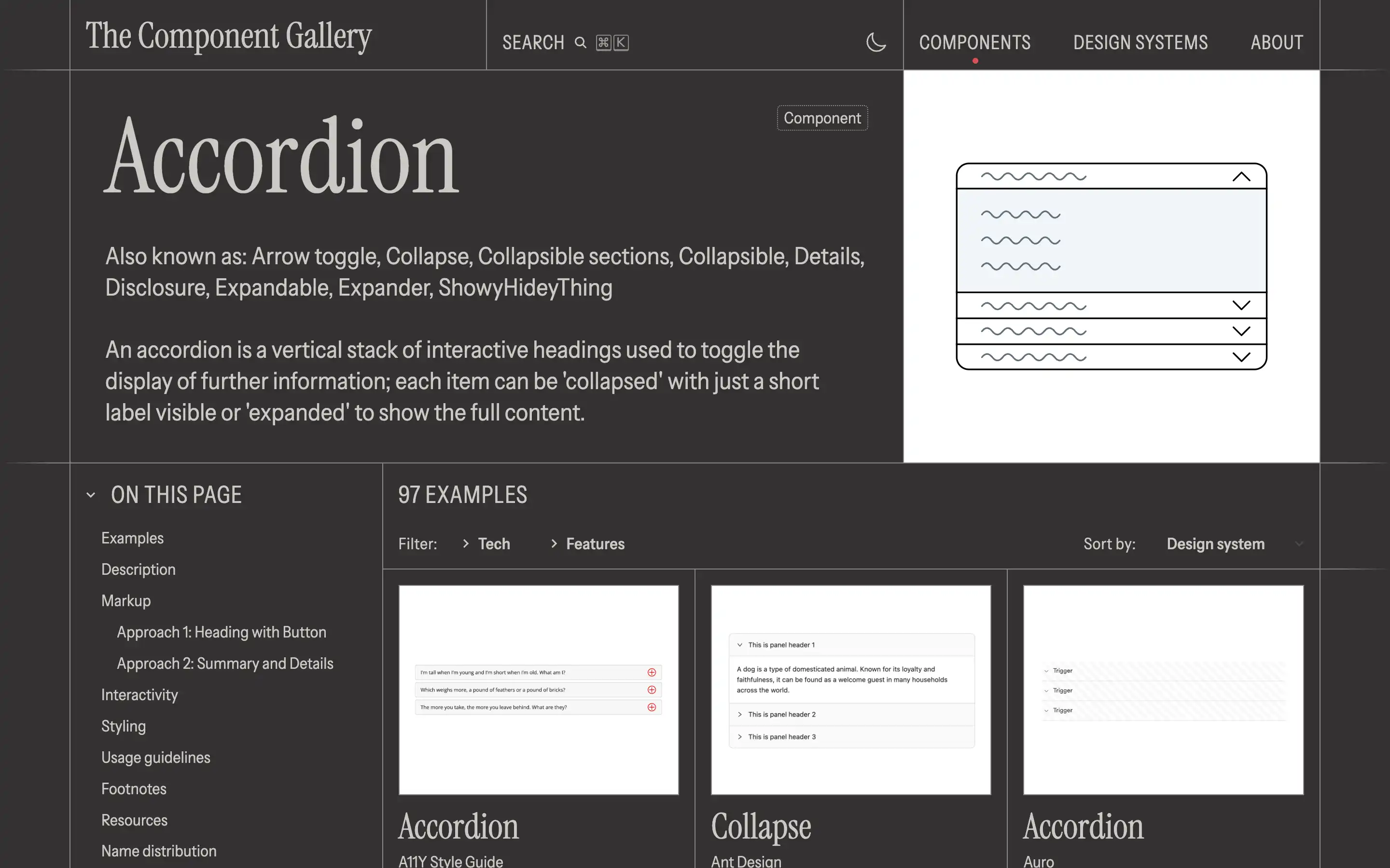
Accordions are commonly used to reduce clutter and improve the organization of content, particularly on smaller screens where vertical space is limited.
Styling the accordion is also discussed, with guidance on how to leverage the aria-expanded attribute to control the appearance of the component, as well as tips for overriding default browser styles. It also provides a comprehensive list of resources, including design guidelines, accessibility considerations, and examples from various design systems, giving readers a wealth of information to draw from when implementing their own accordion components.


