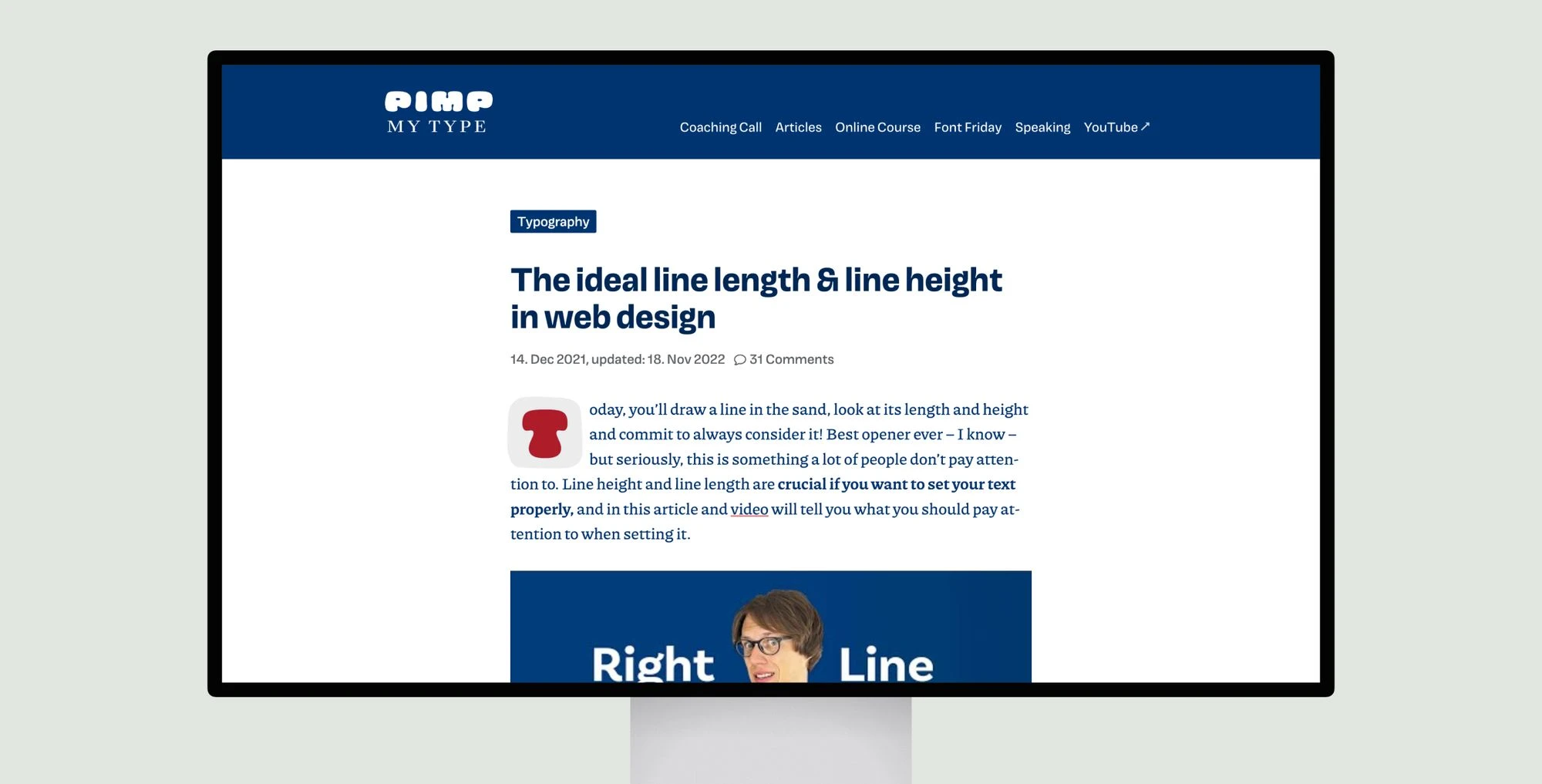
A thorough guide to setting the optimal line length and line height for text on websites. The article states that for desktop reading, lines of 60-80 characters with a line height of 1.5-1.6 times the font size results in an even “typographic color” or readability. Shorter lines can have tighter line spacing. Examples demonstrate how line height affects the visual density and spacing of blocks of text.
The goal is readability, not cramming in too much text or having it appear sparse. It recommends selecting a typeface before adjusting line length and height since metrics vary. Typography involves aspects of both art and science, so guidelines should be considered but room left for personal choice.
The ideal line length & line height in web design
Learn to optimize line length and height for web text readability with guidelines, examples, and tips for balanced typography.
Topic(s):
Added on:

UI & UX design inspiration for mobile & web apps.


