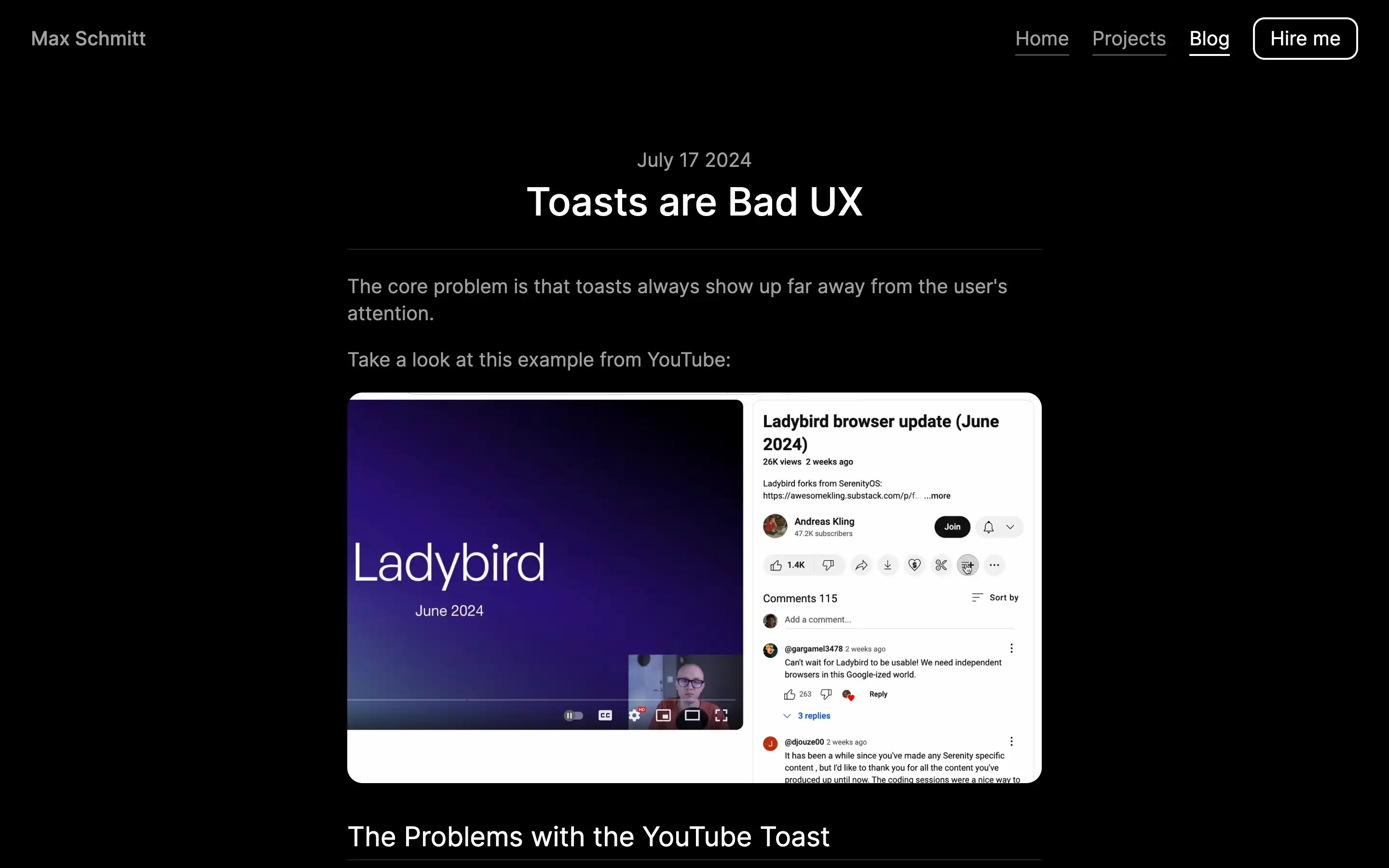
Max Schmitt makes a compelling case against the use of toasts, a common UI element that provides feedback to users. He argues that toasts are problematic because they appear far away from the user’s attention, disrupting the interaction flow. Using examples from YouTube and Gmail, the article demonstrates how toasts can be jarring, delayed, and ultimately unnecessary.
While he acknowledges that a toast is better than no feedback, the overall message is clear: toasts are a suboptimal solution, and designers should strive to integrate feedback directly into the user’s workflow, creating a more seamless and intuitive experience.
