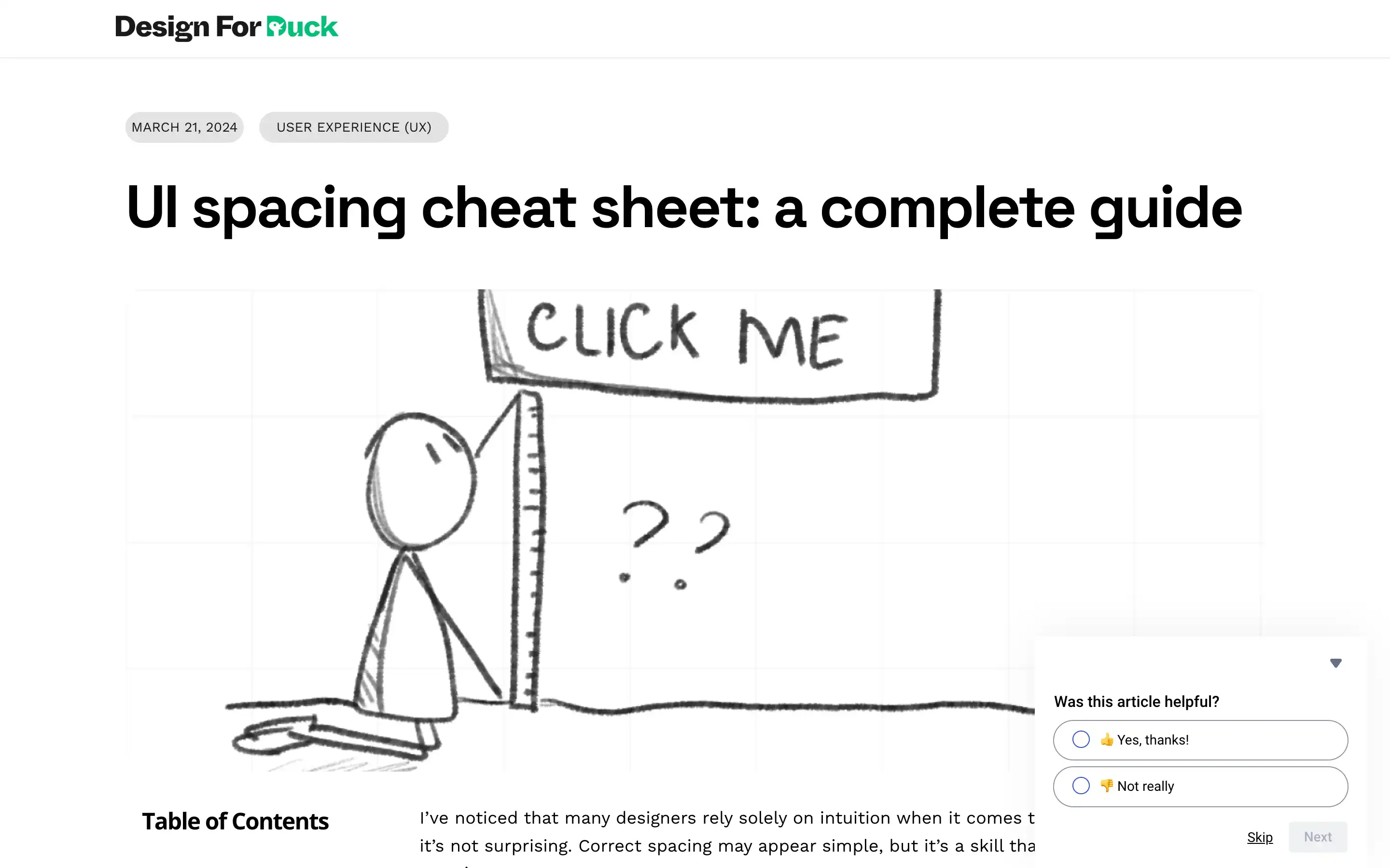
Designers often struggle with spacing in their UI designs, relying too heavily on intuition rather than a structured approach. UI spacing cheat sheet introduces the 8-point grid system, a powerful tool for establishing consistent and visually appealing spacing.
The 8-point grid divides the layout into a grid, with each unit equal to 8 pixels or points. This system allows designers to easily create balanced spacing increments and maintain visual cohesion across screen sizes and devices. The guide emphasizes the importance of “spacing friendship,” where elements are grouped based on their perceived relationship, further enhancing the design’s hierarchy and scalability.
Recognizing that spacing is relative to the overall design; the guide delves into adjusting the system for different font sizes and use cases. It introduces the concept of a “base unit” (x) that can be adjusted to create more compact or spacious designs while maintaining consistency.
UI spacing cheat sheet stresses the importance of limiting spacing options and consistency, as design projects can quickly become messy without a structured approach. By embracing the 8-point grid and the principles outlined, designers can create visually harmonious and user-friendly interfaces that delight their audience.


