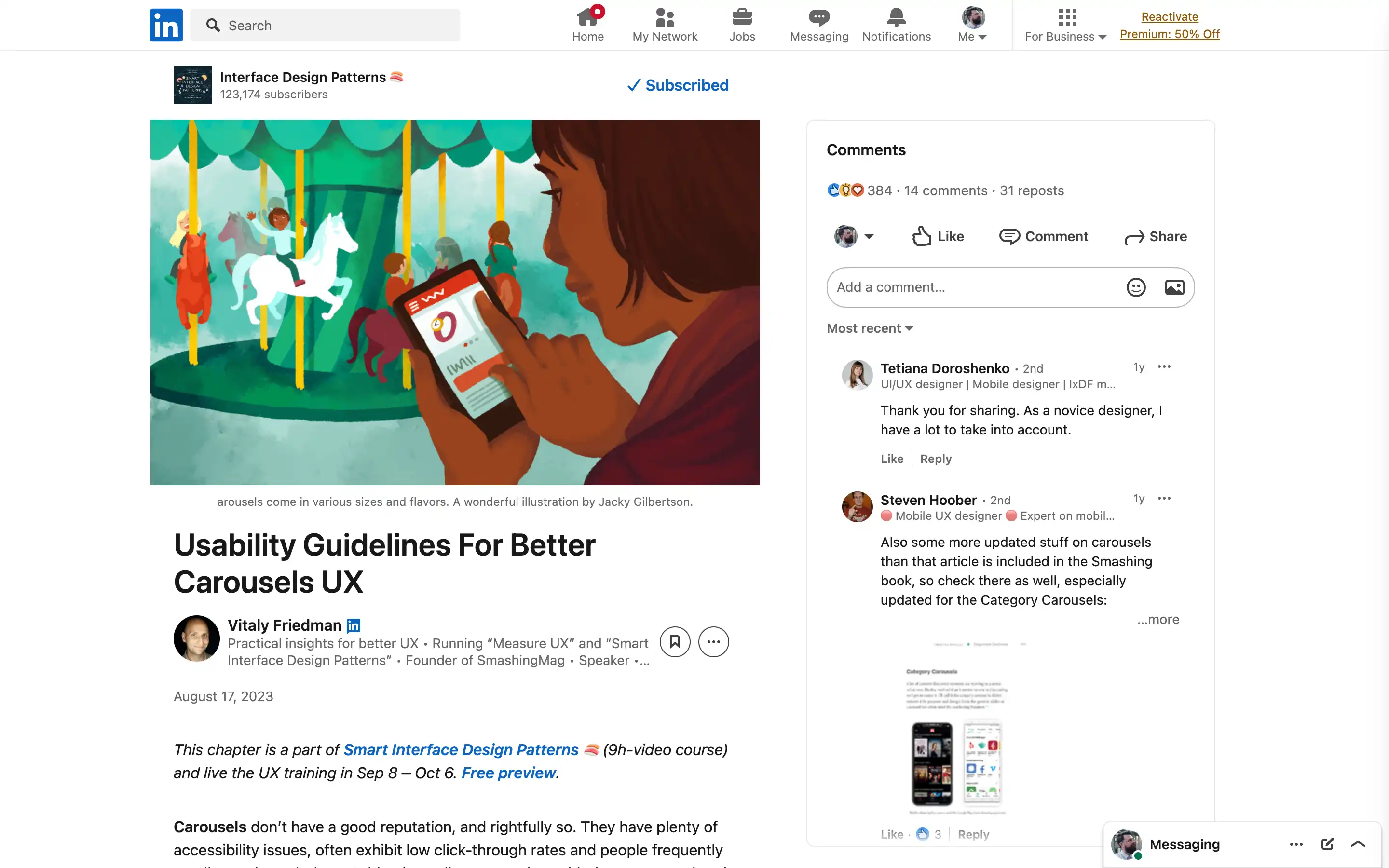
Carousels, a ubiquitous design pattern, often fail to deliver an optimal user experience. While they may seem like a convenient way to showcase multiple options, their accessibility issues, low click-through rates, and the tendency for users to scroll past them make them a troublesome design choice. However, when implemented thoughtfully, carousels can be quite effective, mainly when users explore options, browse reviews, or examine product features.
The key to designing better carousels is replacing the traditional progress dots with more informative labels, thumbnails, or icons. This not only provides users with a better understanding of the content but also encourages higher engagement rates. Grouping the previous and next buttons, either above or below the carousel, can also improve navigation and reduce the risk of accidental jumps between slides.


