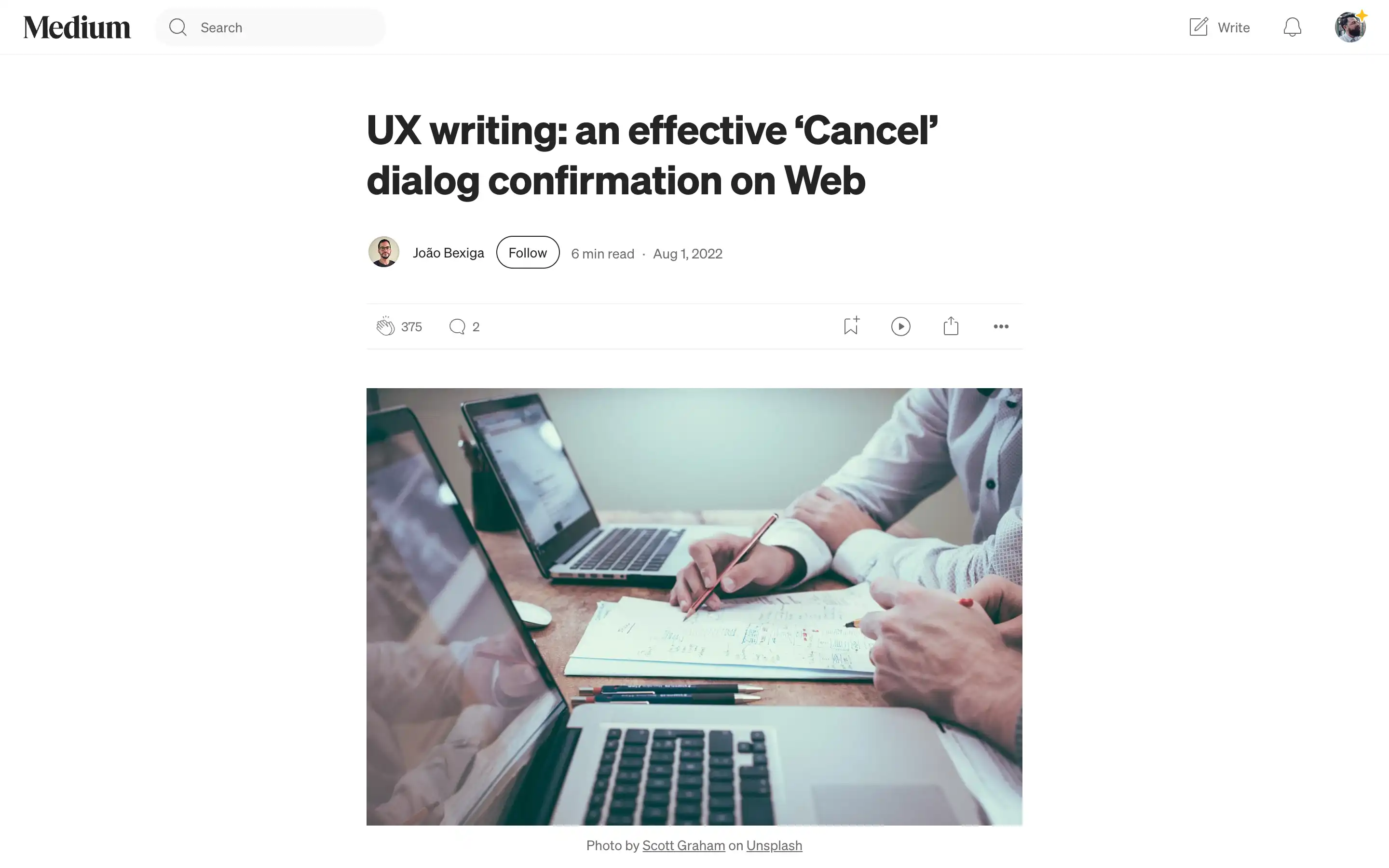
Designing an effective ‘Cancel’ dialog confirmation is crucial for providing a seamless user experience on web applications. João Bexiga delves into three common scenarios where users may want to abandon a flow or task and explore how to craft clear, user-friendly confirmation dialogs.
João outlines a generic guideline for ‘Cancel’ confirmation dialogs, which includes a straightforward question about the action, a description of the consequences, an alternative way out, and a decisive action button. This guideline is then applied to three specific scenarios: canceling a creation flow, canceling an editing flow, and canceling a previously executed task.
The key takeaway is the importance of crafting confirmation dialogs that are straightforward, user-centric, and avoid potential conflicts or confusion. By following a structured approach and considering the user’s perspective, designers can create ‘Cancel’ confirmation dialogs that enhance the overall user experience.


