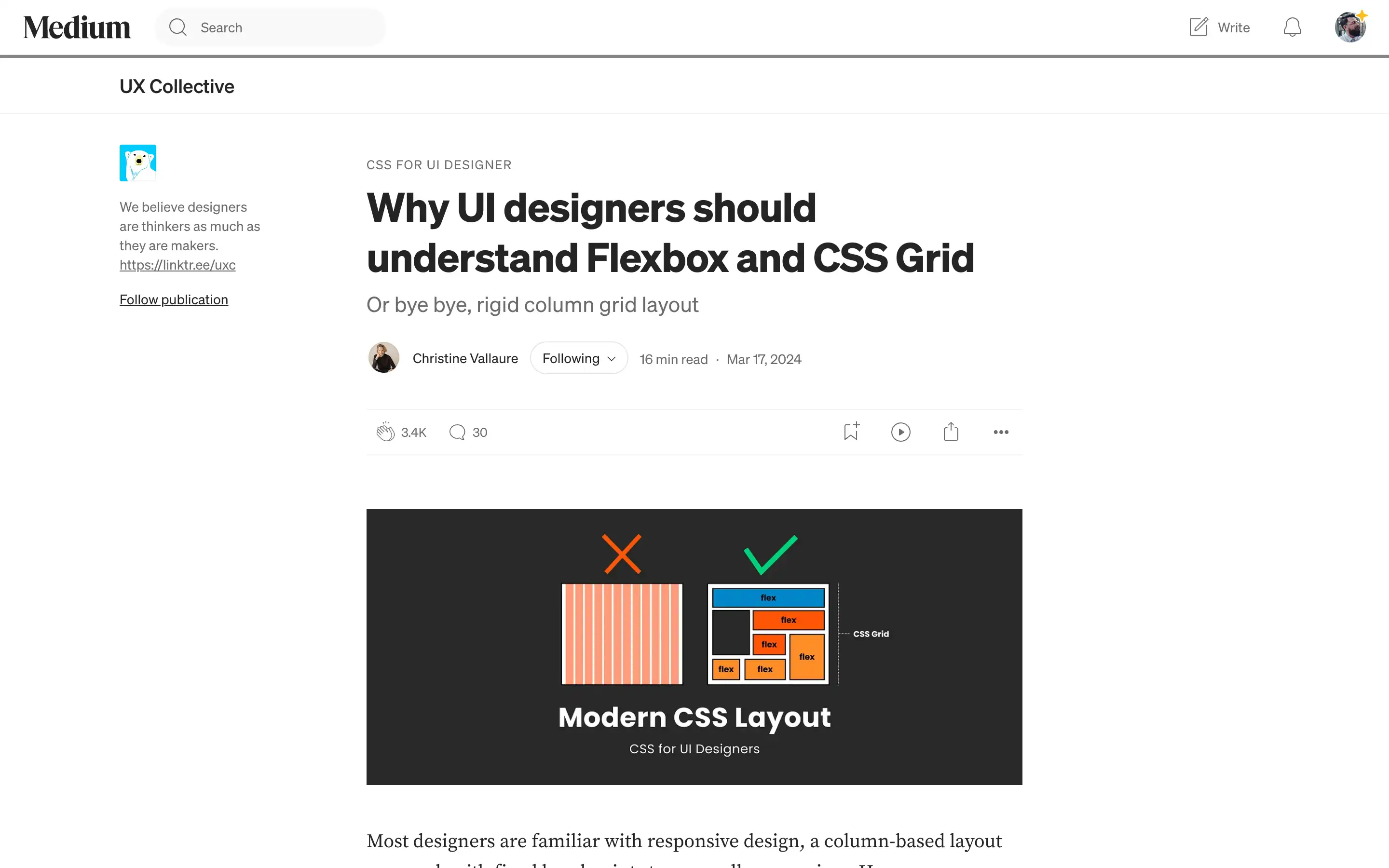
Christine Vallaure’s article emphasizes the importance of modern CSS layout techniques for designers, specifically focusing on CSS Flexbox and CSS Grid. She contrasts traditional, column-based responsive design, which relies on fixed breakpoints and frameworks like Bootstrap, with the flexibility these newer CSS tools offer. Vallaure argues that mastering these techniques enables designers to create layouts that seamlessly adapt to various screen sizes and content, avoiding the limitations of rigid, predefined structures.
One of the key concepts introduced in the article is intrinsic design, where layouts adjust dynamically based on content and available space rather than being based on fixed viewport sizes. This approach provides greater control, allowing designers to fine-tune layouts and accommodate both fixed and flexible components, giving designs more fluidity. Vallaure encourages designers to familiarize themselves with Flexbox and CSS Grid, noting that this knowledge not only improves the adaptability of designs but also enhances collaboration between designers and developers.


