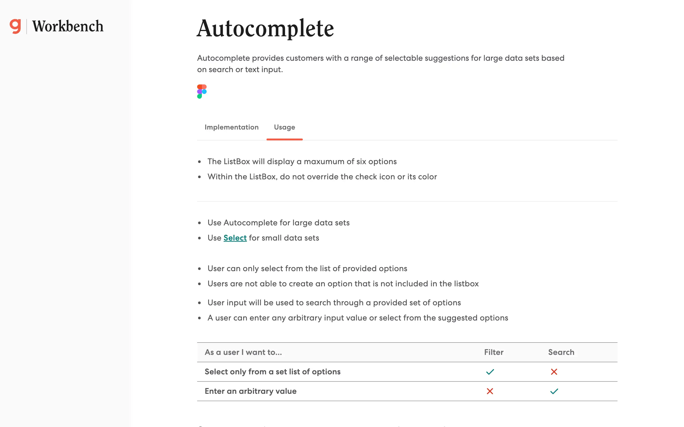
Autocomplete component provides a flexible and efficient solution for managing large data sets, empowering users to find and select the desired information quickly. The guidelines suggest that the ListBox display a maximum of six options and that the check icon and its color should not be overridden. Autocomplete is recommended for large data sets, while Select is better suited for small data sets.
The key difference between Filtering and Searching is that Filtering allows users to select from a predefined list of options. In contrast, Searching enables users to enter any arbitrary input value or select from the suggested options. Option groups can be utilized to categorize related options, improving the user experience when dealing with complex data.


